South East National Bank
Enhancing the discoverability and usability of banking workflows.
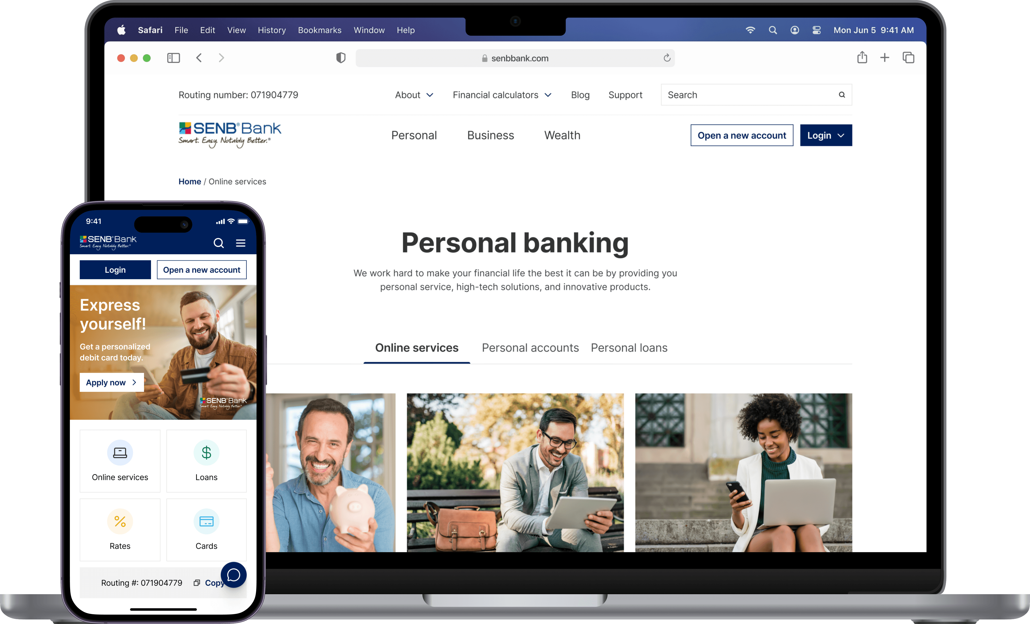
After
B2B / B2C
Website redesign
Role Product Designer
Team 1 PD, 1 PM, Engineers
Duration 1 month
Project type Industry
Background
SENB Bank is a community bank in the Quad Cities area that faced challenges with its online presence despite its strong local service.
Contribution
Research
UI design
Prototyping / Interaction design
Contact
Overview
SENB's website redesign improved information accessibility and simplified banking processes to increase new account openings, enhance user engagement, and reduce support requests.
"It's like the website is stuck in the past, cluttered and confusing. I often end up giving up because I can't find what I need quickly. It shouldn't be this hard."
— Anonymous customer review
Solution
Improving information structure and hierarchy.
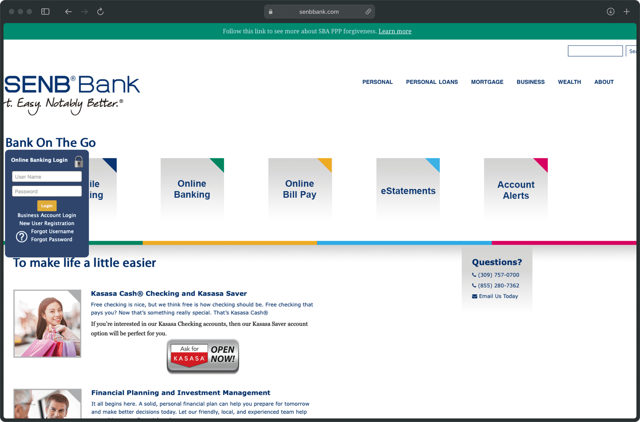
Before
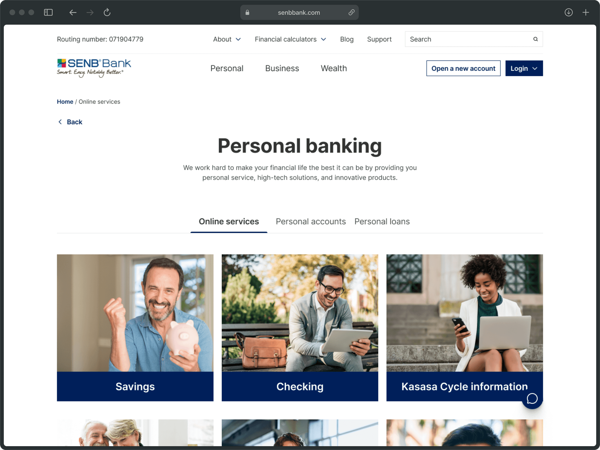
The information on the site was spread in a random manner. It also had deep navigation that did not stick to the top and lacked indicators.
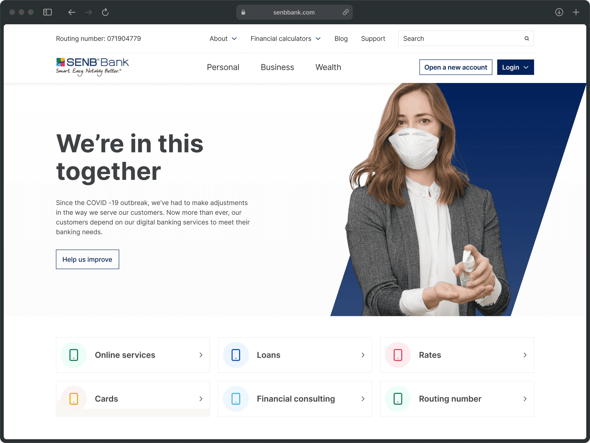
After
In the refresh, I restructured the navigation to make it shallower (up to 2 levels max) and kept the sought-after services and flows at the surface for easy access.
Facilitating user control and freedom.
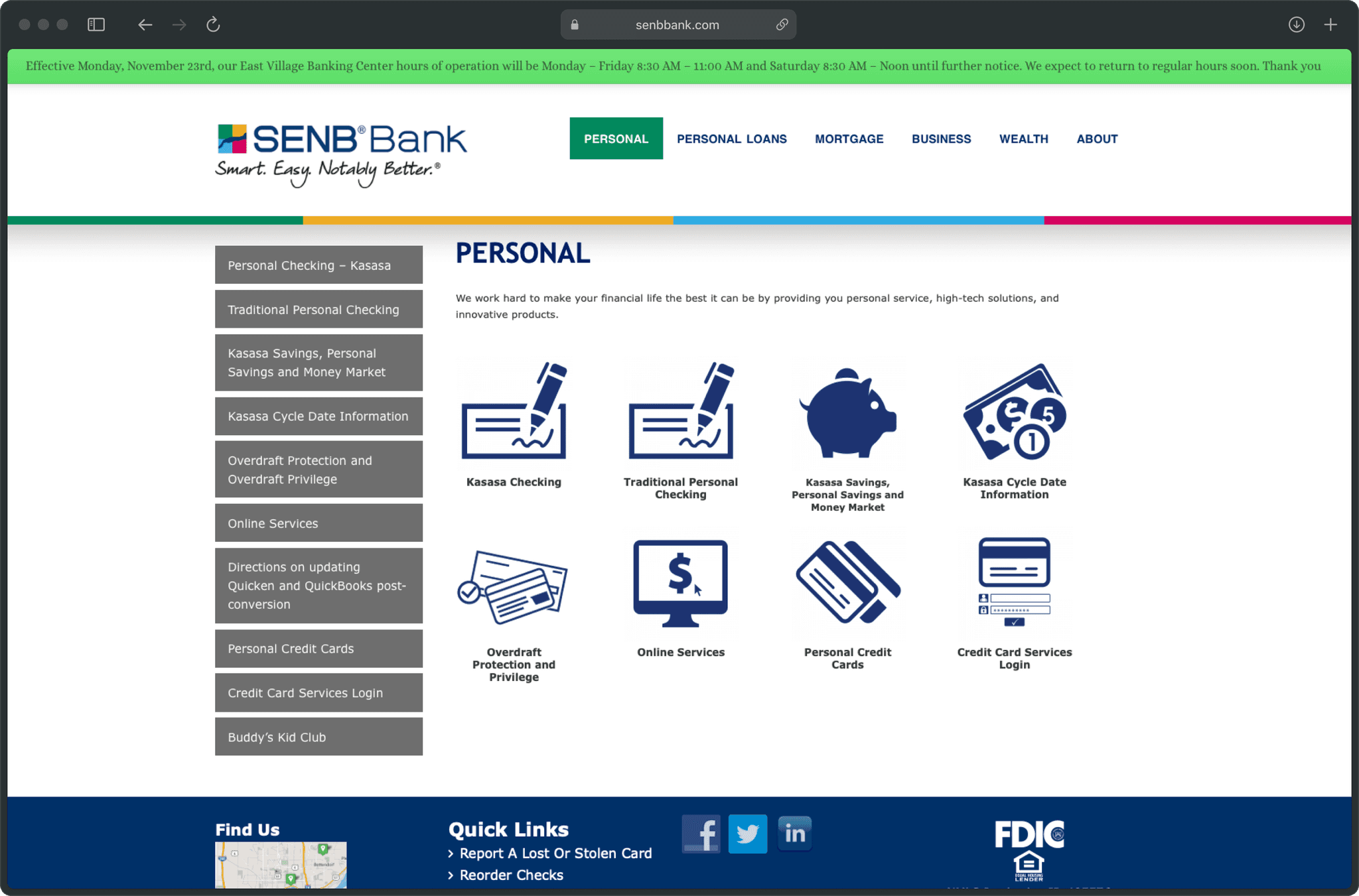
Before
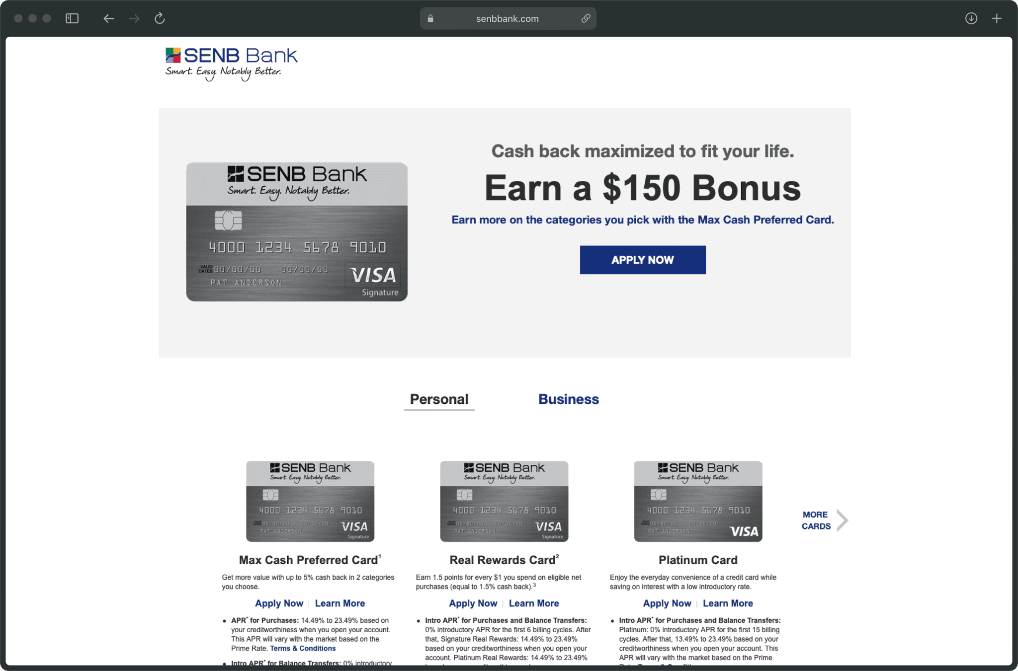
The existing experience wasn't cohesive. Users mostly didn't know where they are on the site, how they got there, and how to go back—similar to the credit card's page below.
After
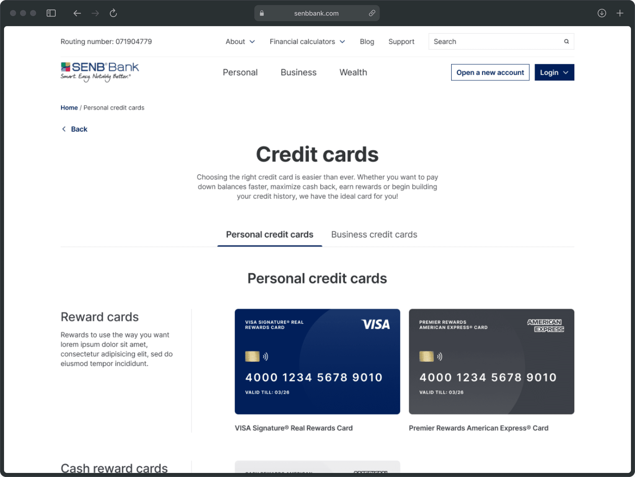
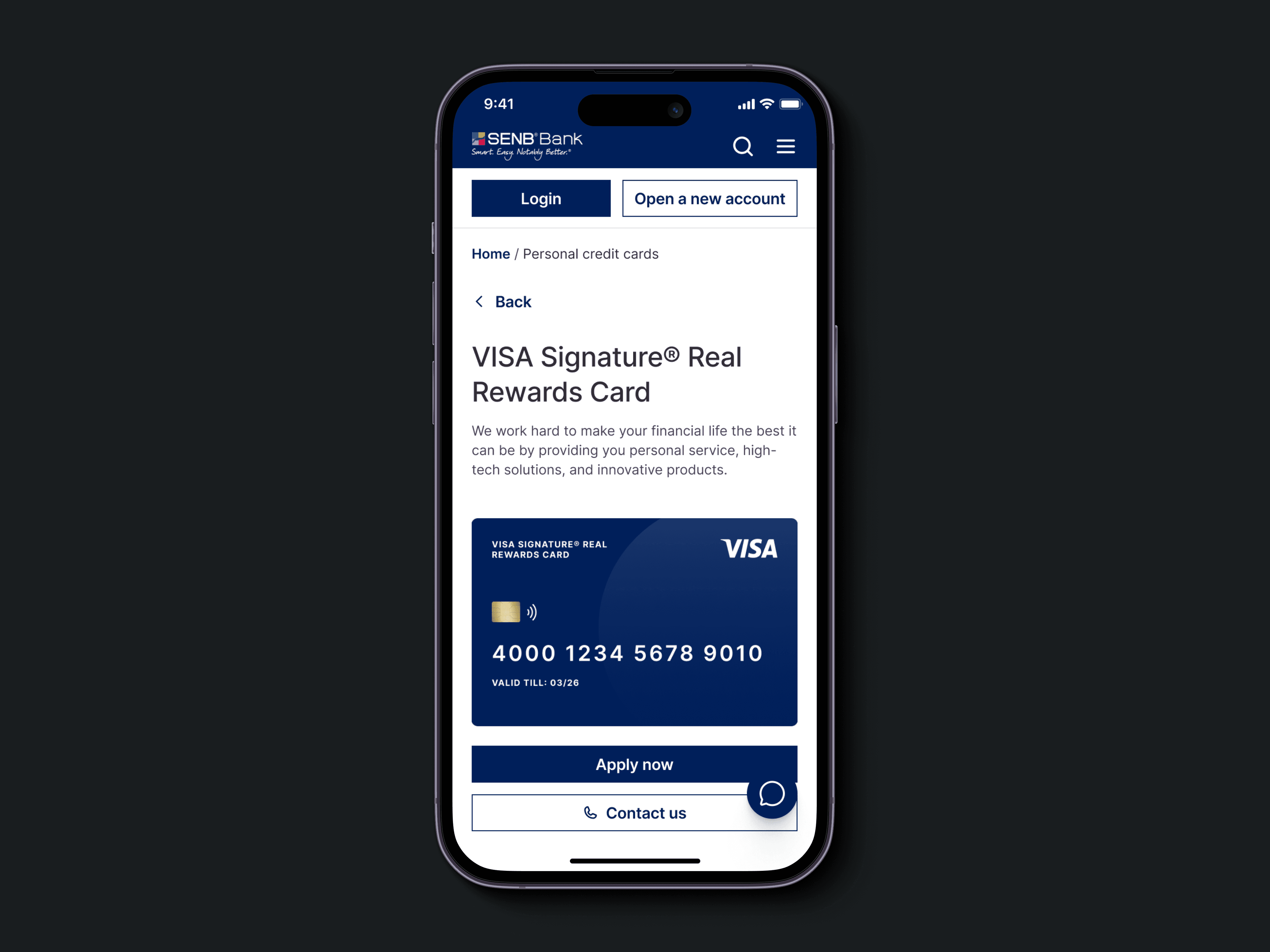
Added clear signs and controls so users always know where they are and what's happening, and can go back if they need to. Also reorganized information-dense pages to bring hierarchy and clarity.
Providing supplemental information whenever needed.
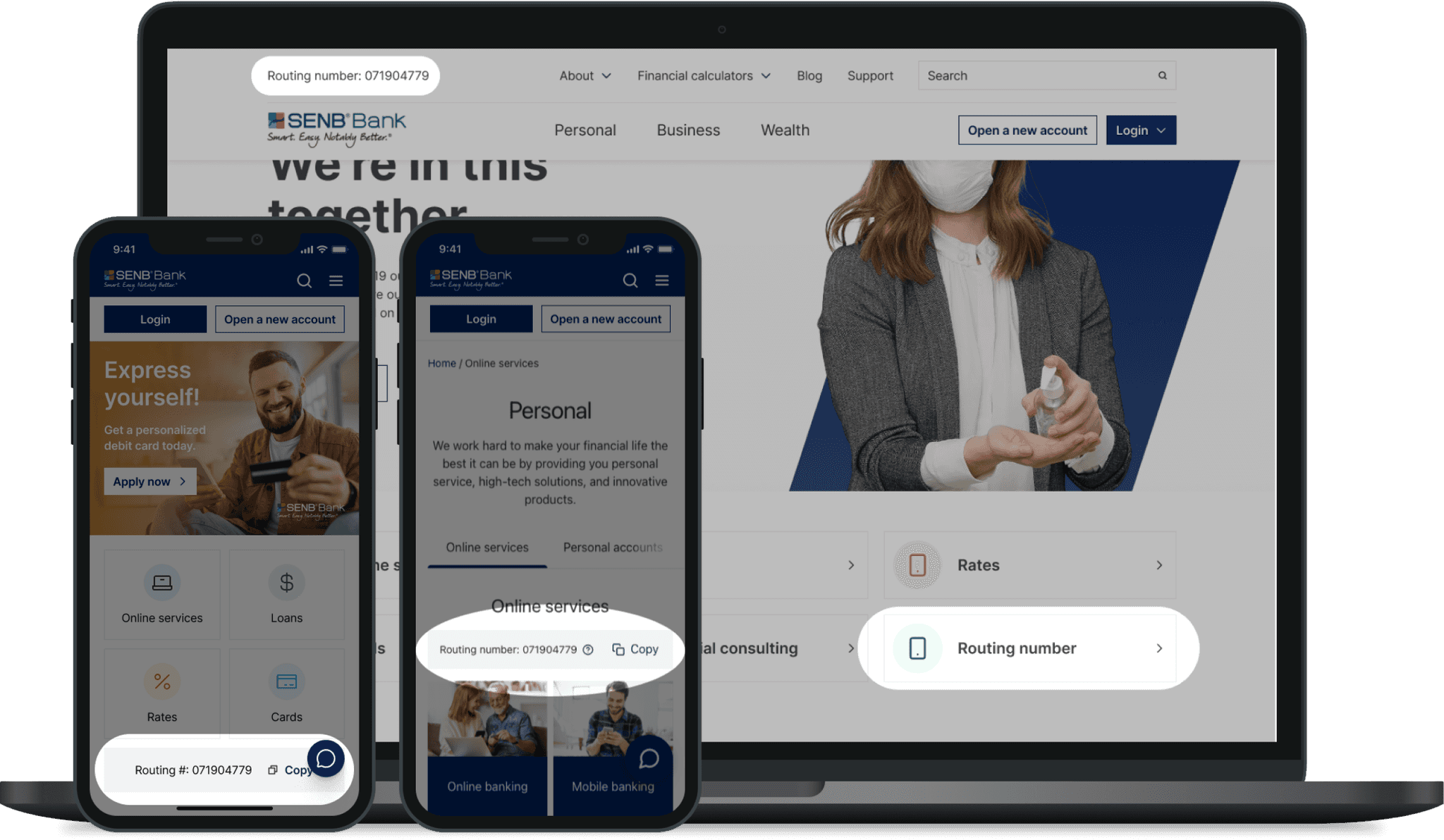
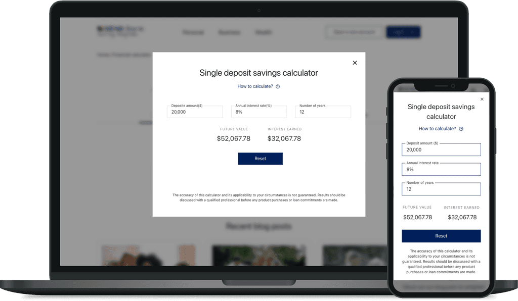
Brought supportive information and services to the forefront, complementing parent flows. For example, the bank's routing number and financial calculators were previously buried under several links, forcing users to break their task flow to find them when needed.
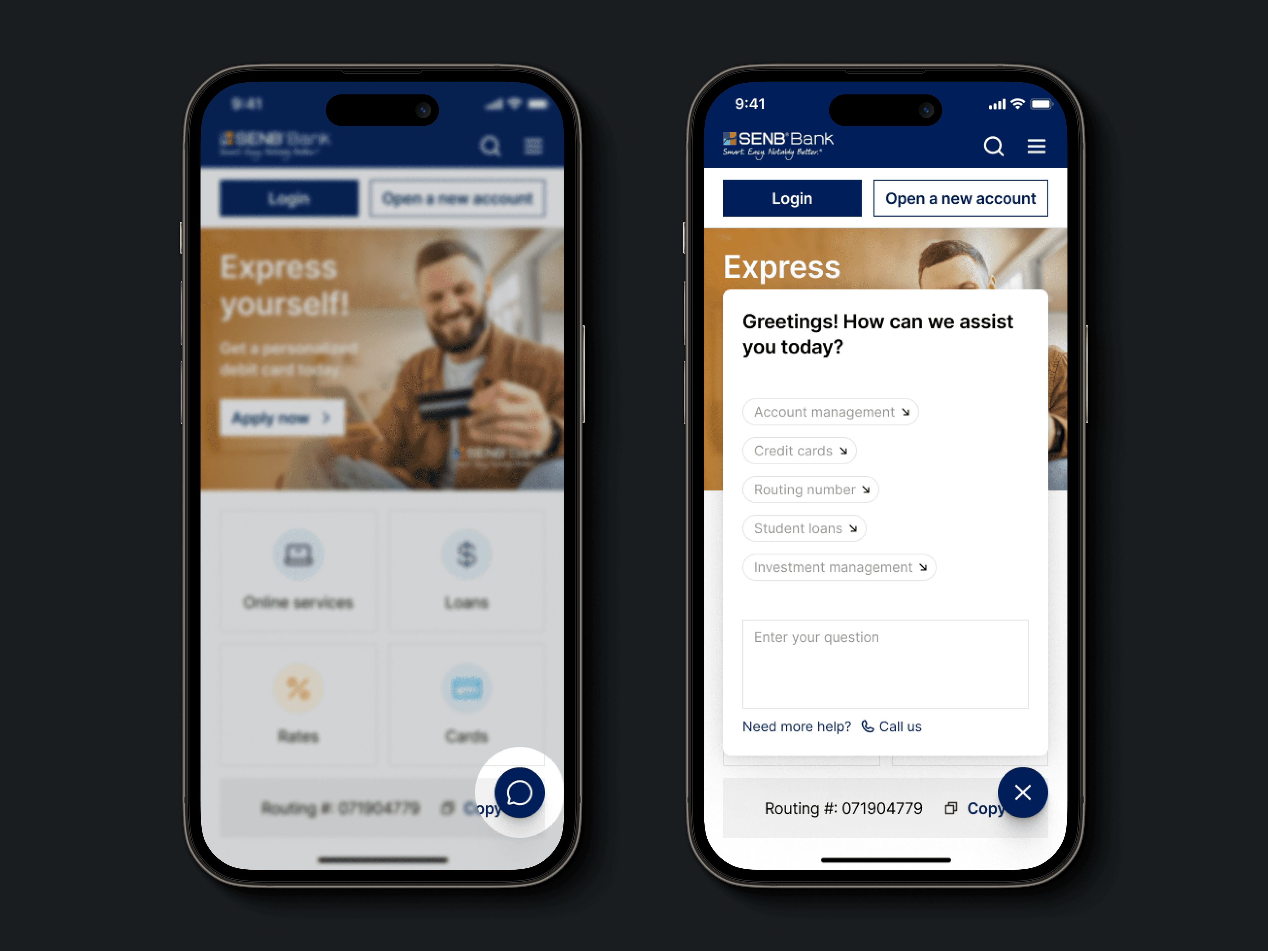
Prioritizing instant help & support.
Before
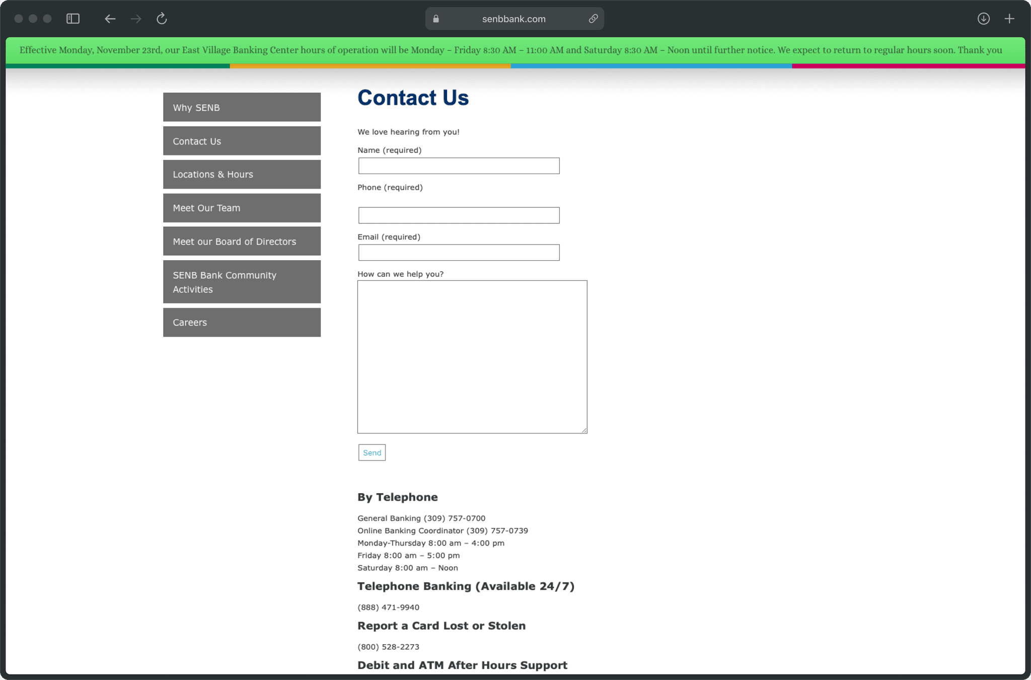
Users had to fill in request forms for the smallest things, and the telephonic service always had long waiting lines. Quick assistance was unavailable.
After
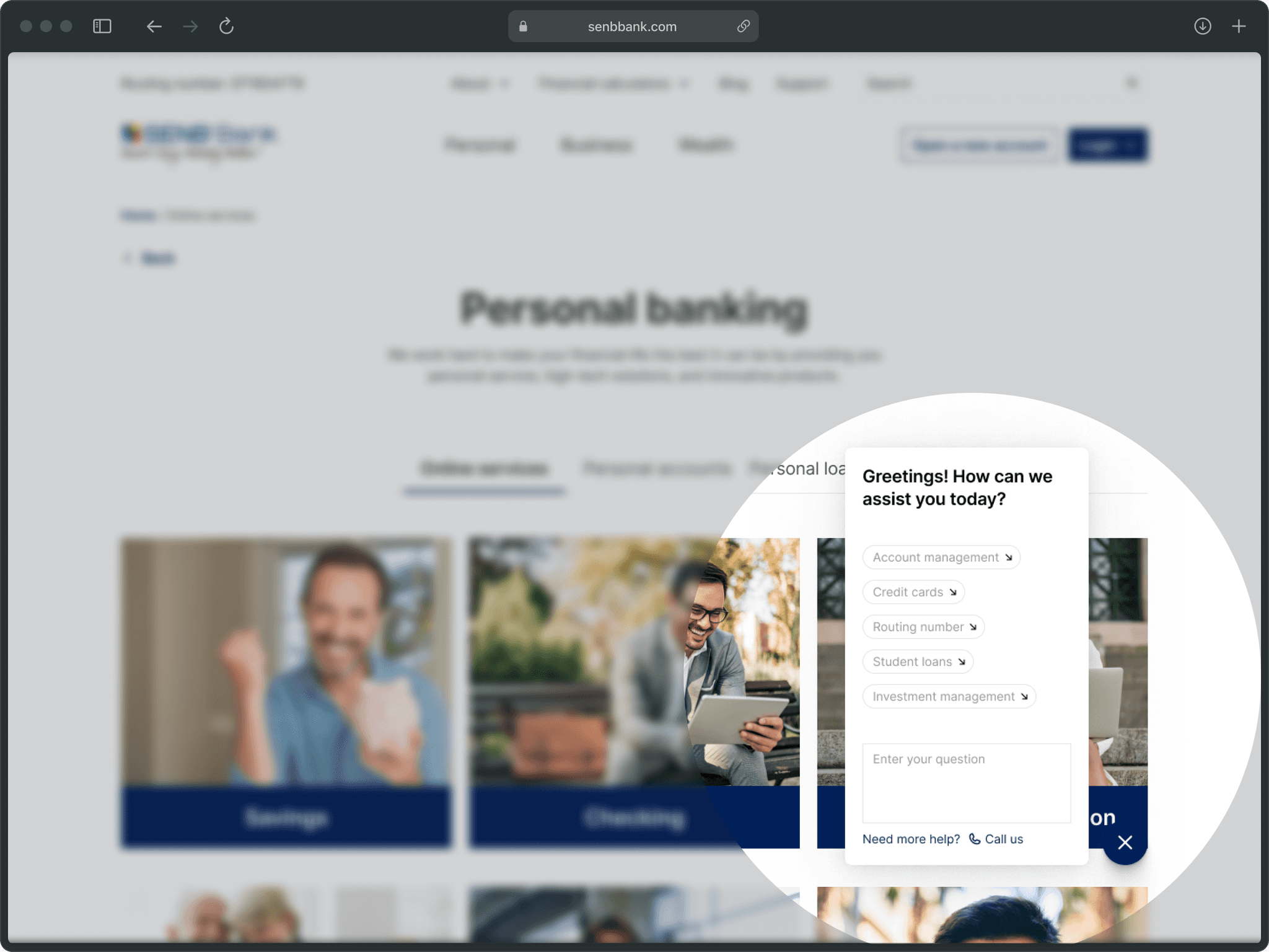
Introduced a chatbot that sticks to the bottom right of the page, always within reach—especially on a handheld device. It contains FAQs, live chat support, and options for further assistance.
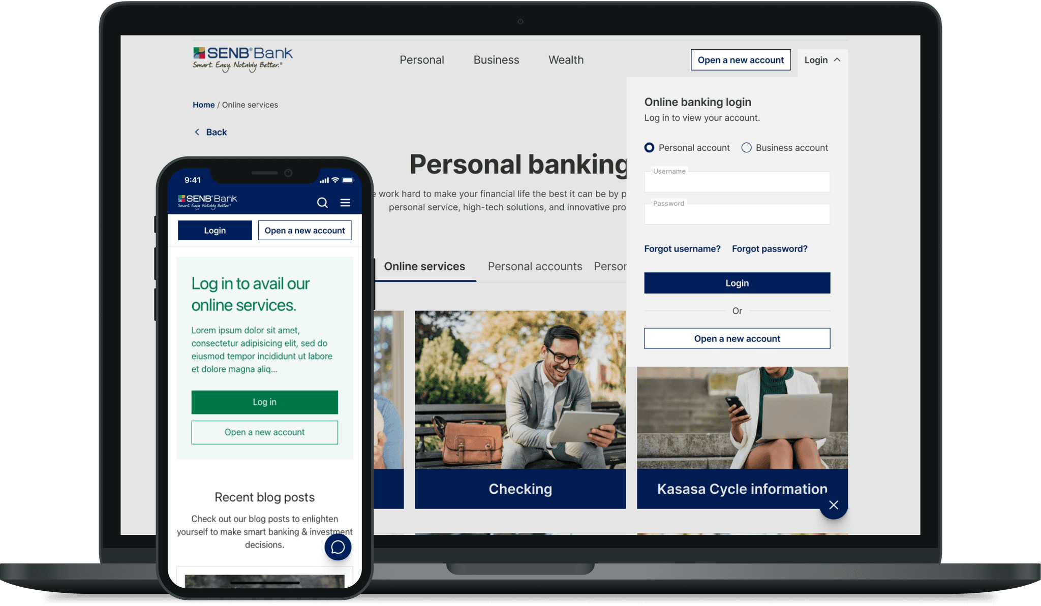
Opening and accessing your account from anywhere.
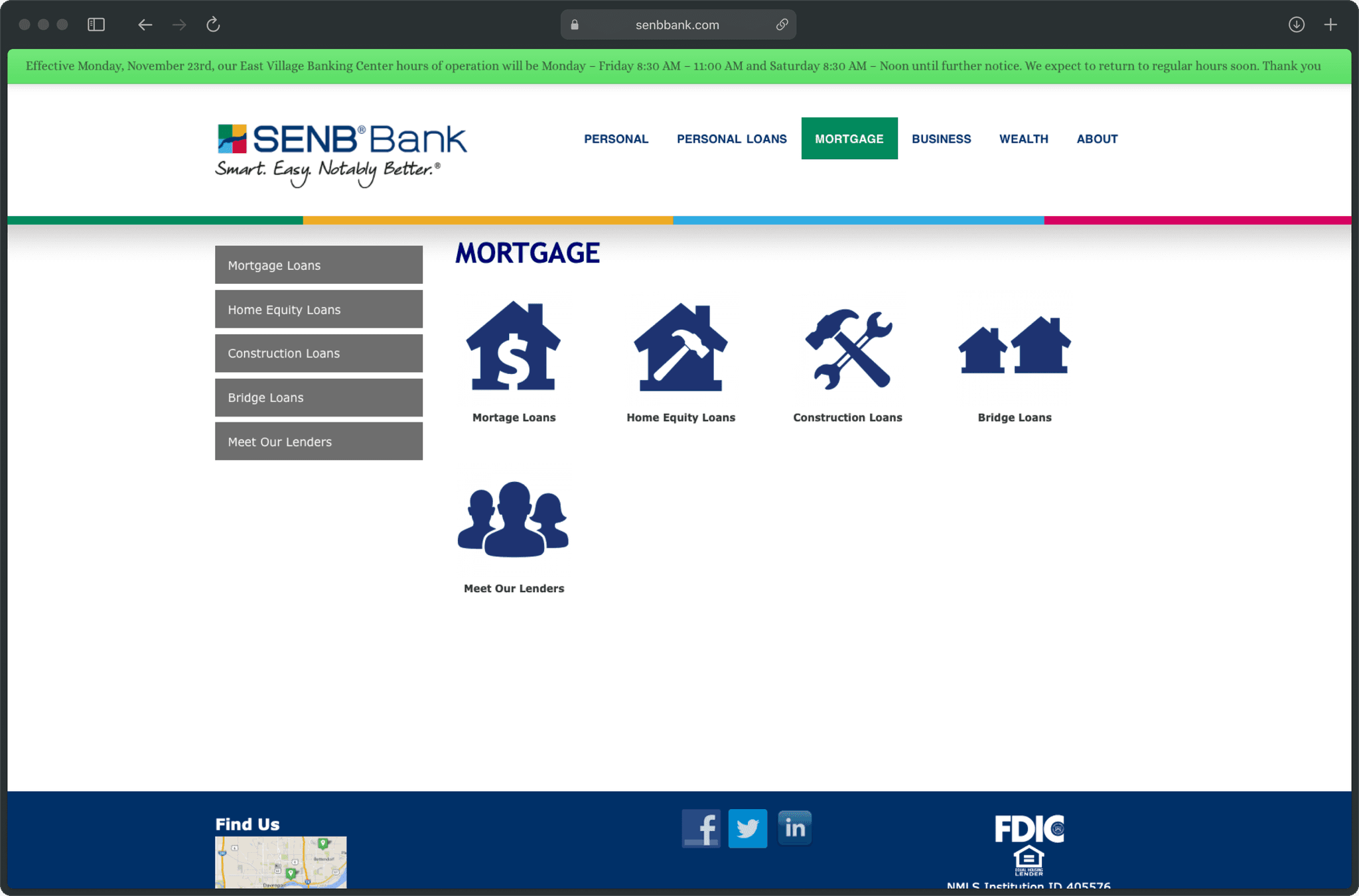
Before
Except for the homepage, there wasn't an option to open or access user accounts. Additionally, the business customers' login link wasn't distinct enough and provided a completely different login experience.
After
Combined different login types into a single fly-out menu and made it a part of the main navigation for easy access. Also added supplementary login banners across inner pages where it's required for users to log in.
Impact
It wasn’t long before the metrics improved.
"I haven't called customer service for help at all. Everything I need is easy to find, especially my routing number for setting up direct deposits."
— Anonymous customer review
Bounce rate
24%
67% – 50.92%
Improved usability and discoverability reduced task abandonment.
Avg. session duration
48%
1m45s – 2m35s
Intuitive navigation made it easier to access information on the site.
Task completion rate
27%
32% – 40.64%
Users could now do tasks online that they used to do in person at a branch.
Account openings
57%
~3% – 4.17%
Noticeable increase in new account openings and loan applications.
Note: The impact metrics were observed over approximately 12 months after development to determine the effectiveness of the changes on user behavior and engagement.