Staples
Shipped
@ Galaxy Weblinks
TL;DR: Staples established an offshore team of designers at Galaxy to assist in revamping their entire online experience, utilizing the newly-introduced Sparq design system.
Role: Lead Designer
Team: 4 UX Designers, 1 Project Manager
Duration: ~2 years (Nov 2019 - July 2022)
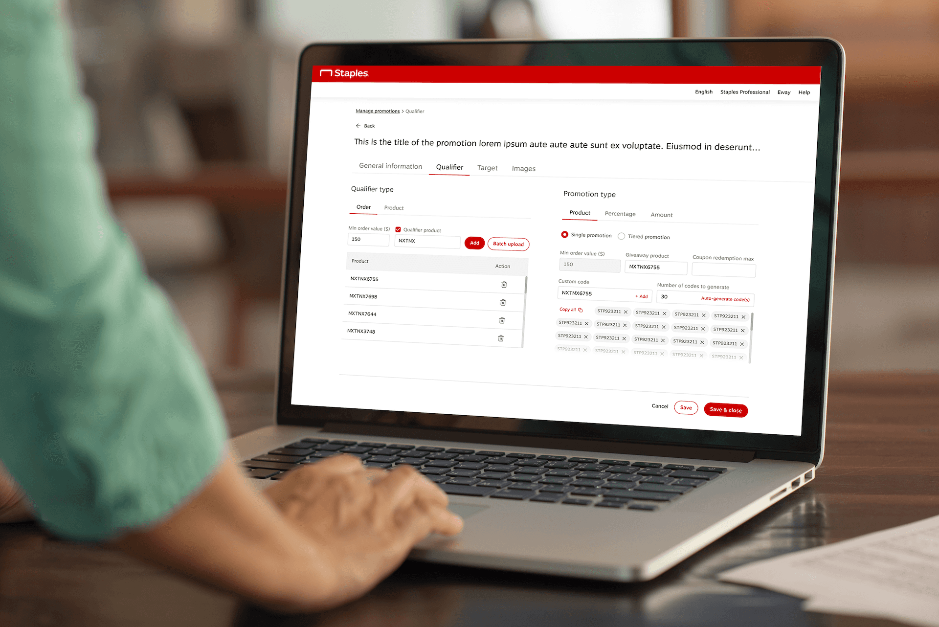
I led the Staples offshore team of designers in India, formed in partnership with Galaxy Weblinks, to elevate their consumer and business-facing online experiences.
Featured Cases
Design System Maintenance
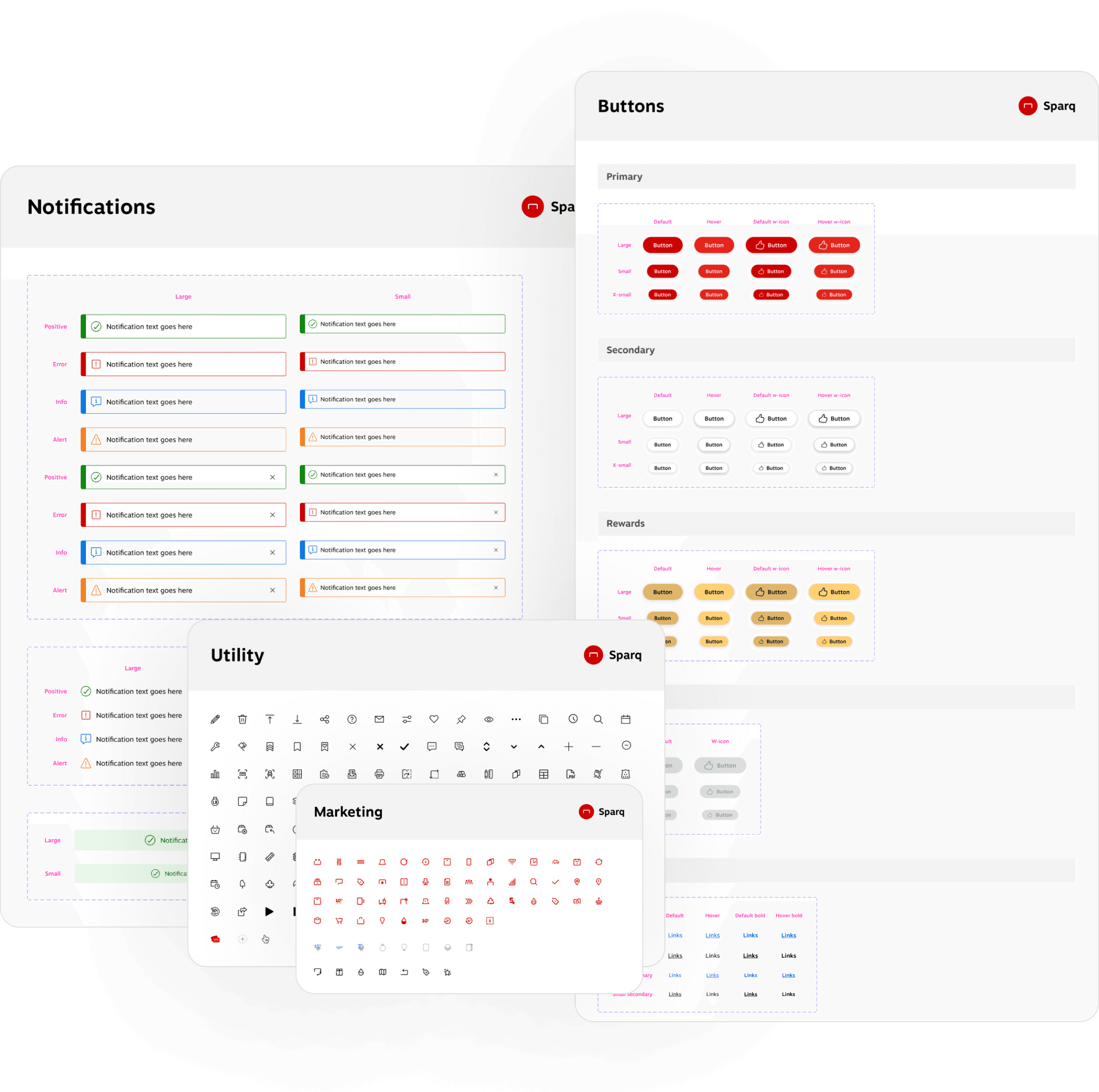
Our primary responsibility was to assist Staples in building, refining, and managing their new Sparq design system.
Designing Visual Comps
Simultaneously, we were tasked to use this new system to revamp staples.com and staplesadvantage.com.
Featured Cases
Staples's Sparq design system is a collection of reusable design components along with design styles, guidelines, and principles - utilized to create consistent interfaces and marketing collateral.
Design Library
Includes essential design components (buttons, input fields, accordions, grids, toggles, etc.) and various type, color, and effect styles, used across Staples' websites and apps.
Icon Library
Contains different types of icon sets, ranging from utility to marketing icons, with each icon in three different sizes.
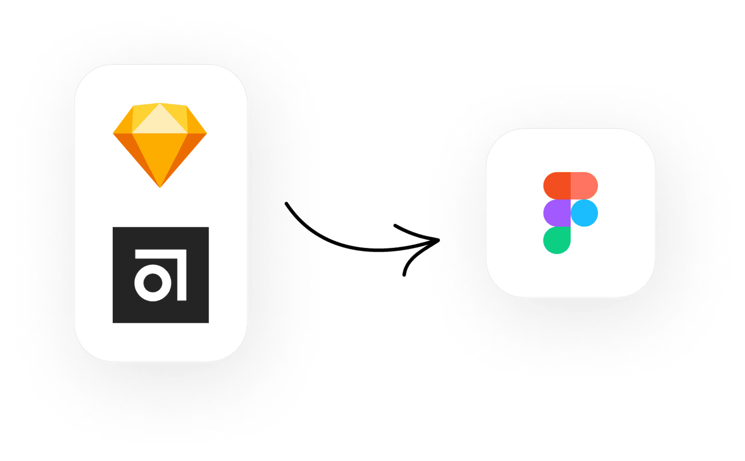
In early 2020, Staples switched to Figma as their primary tool for design and organizing projects from Sketch and Abstract.
To ensure a quick and efficient transition, while maintaining design consistency and brand identity across various platforms, we extensively utilized some of the key features of Figma:
Auto Layout
For consistent padding, spacing, and alignment, dynamic resizing, and directional flexibility.
Components & Variants
Facilitated an organized workflow and reduced significant iteration time.
Plugins
Saved time and effort by automating tasks that were low in value but high in labor.
Featured Cases
The entire redesign was split into different domains such as marketing, cart & checkout, merchandising, etc. - each containing several projects.
Each week, we designed multiple screens for various projects, guided by the sprint requirements and other considerations. To guarantee a seamless and consistent experience across all devices, we created each screen to accommodate eight different viewports, from desktop to mobile
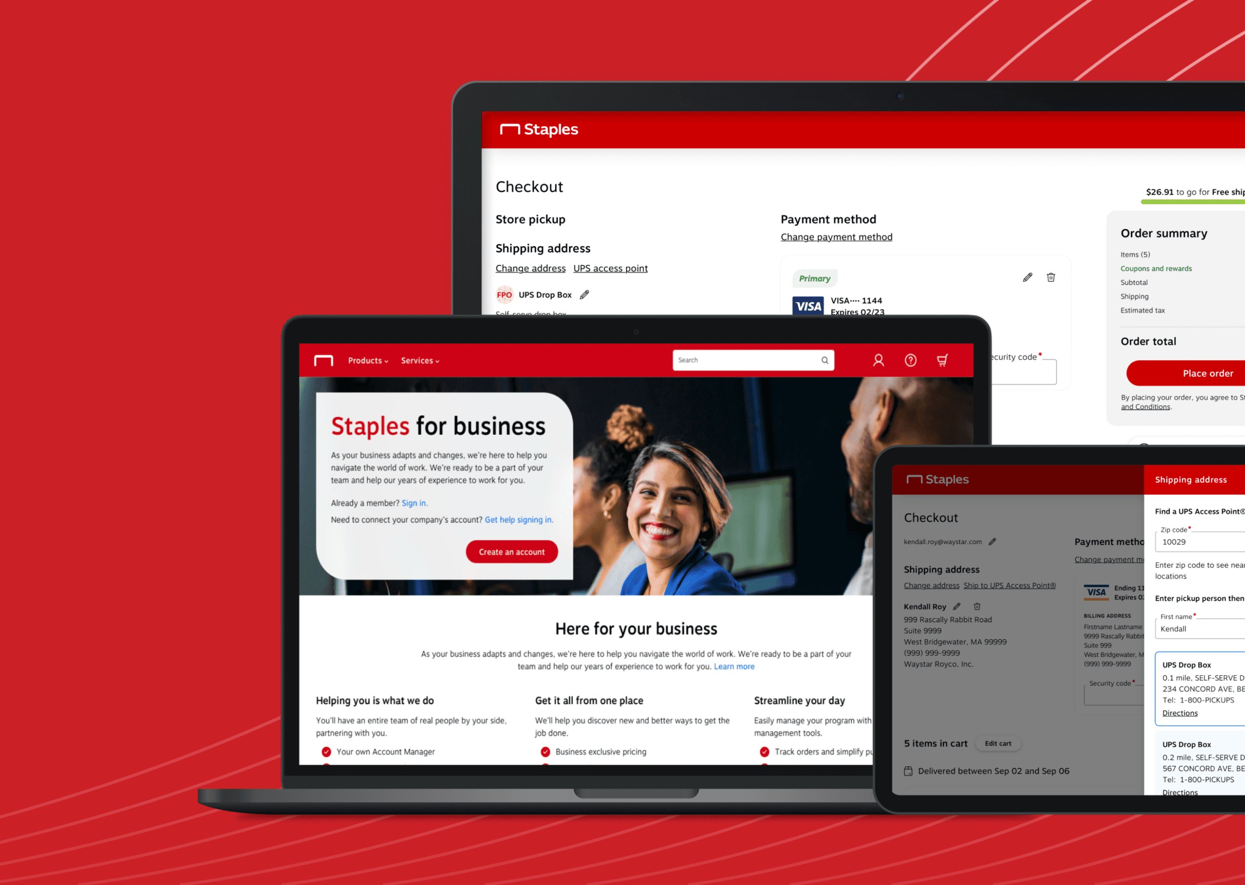
Among the various visual compositions I created, some stand out due to their unique challenges and the creative solutions they required.
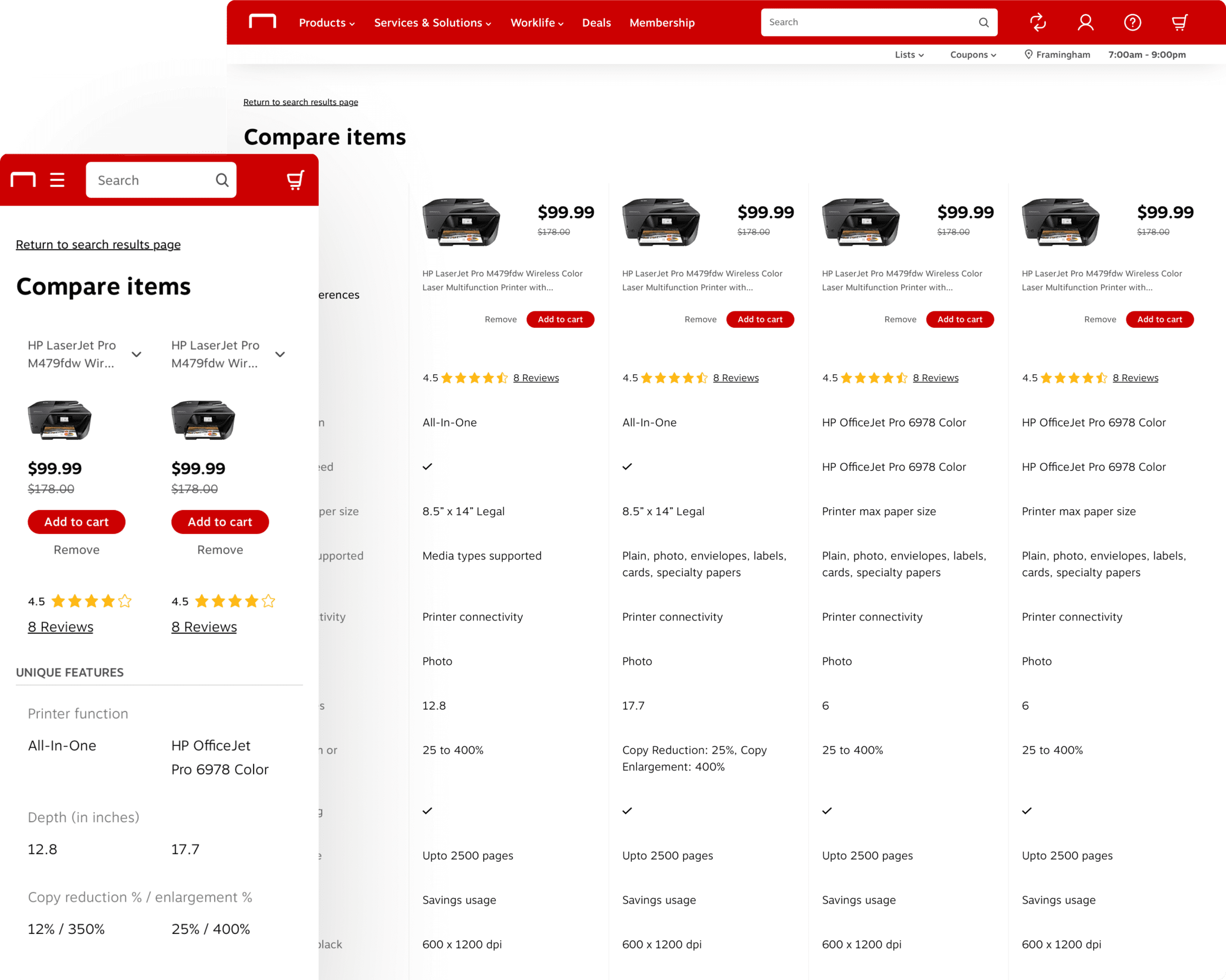
Product Comparison
This page features a table that evaluates the items on various parameters, including price, specifications, and features. After reviewing, users can either add an item to their cart or remove it.
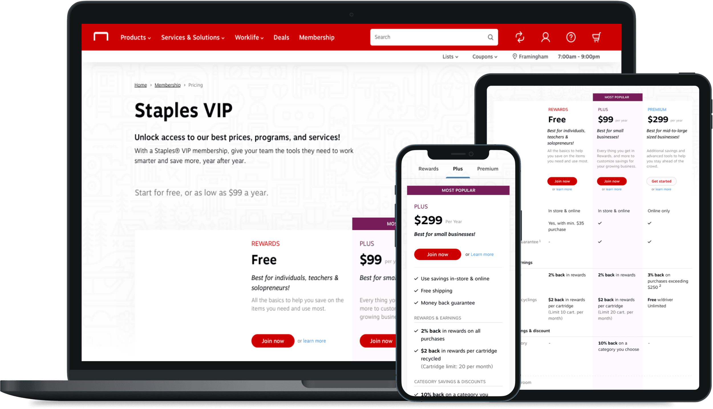
Membership Plans
This page showcases all the membership plans offered by Staples. Each plan is presented in a tabular format, allowing users to easily compare features and determine the best plan for their needs.
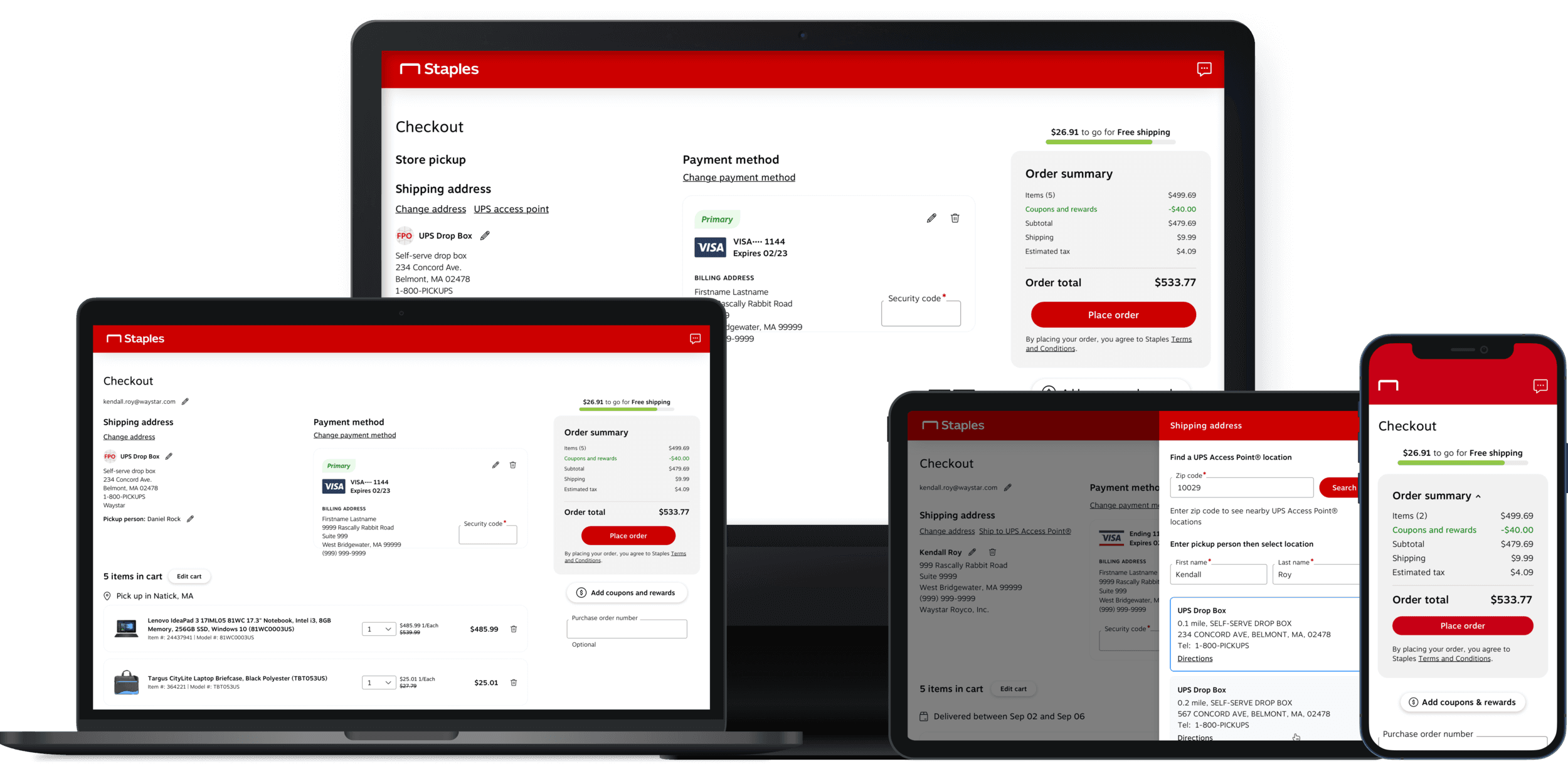
Cart & Checkout
This page is an integral component of a larger checkout flow we developed. As the final stage of this flow, it provides a summary of essential information users need before placing an order.
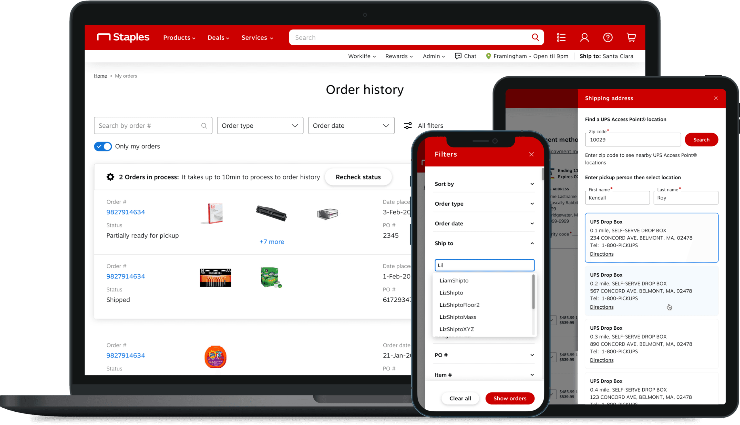
Order History
This page displays a list of all orders placed by a user. Users can view the current status of an order, review it, and initiate requests to return or cancel. Additionally, the page includes several drawers (side menus) that are activated by actions like adding filters or editing a shipping address.
Staples Business Advantage
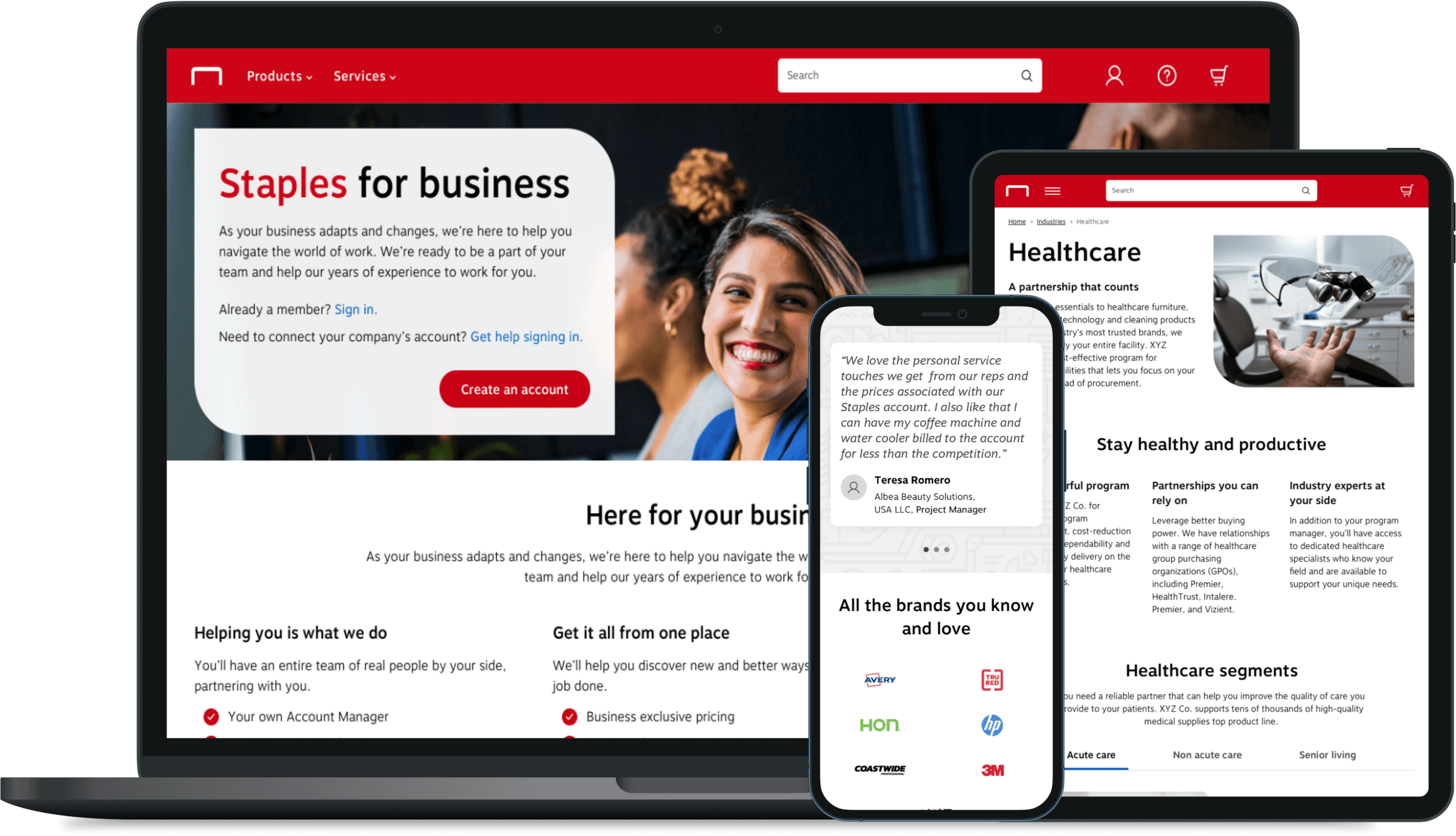
Staples Business Advantage (SBA), the division of Staples focused on business-to-business (B2B) customers, was a key area of our work. We created a series of landing pages for SBA, including a master home page and various industry-specific inner pages.
Email Templates
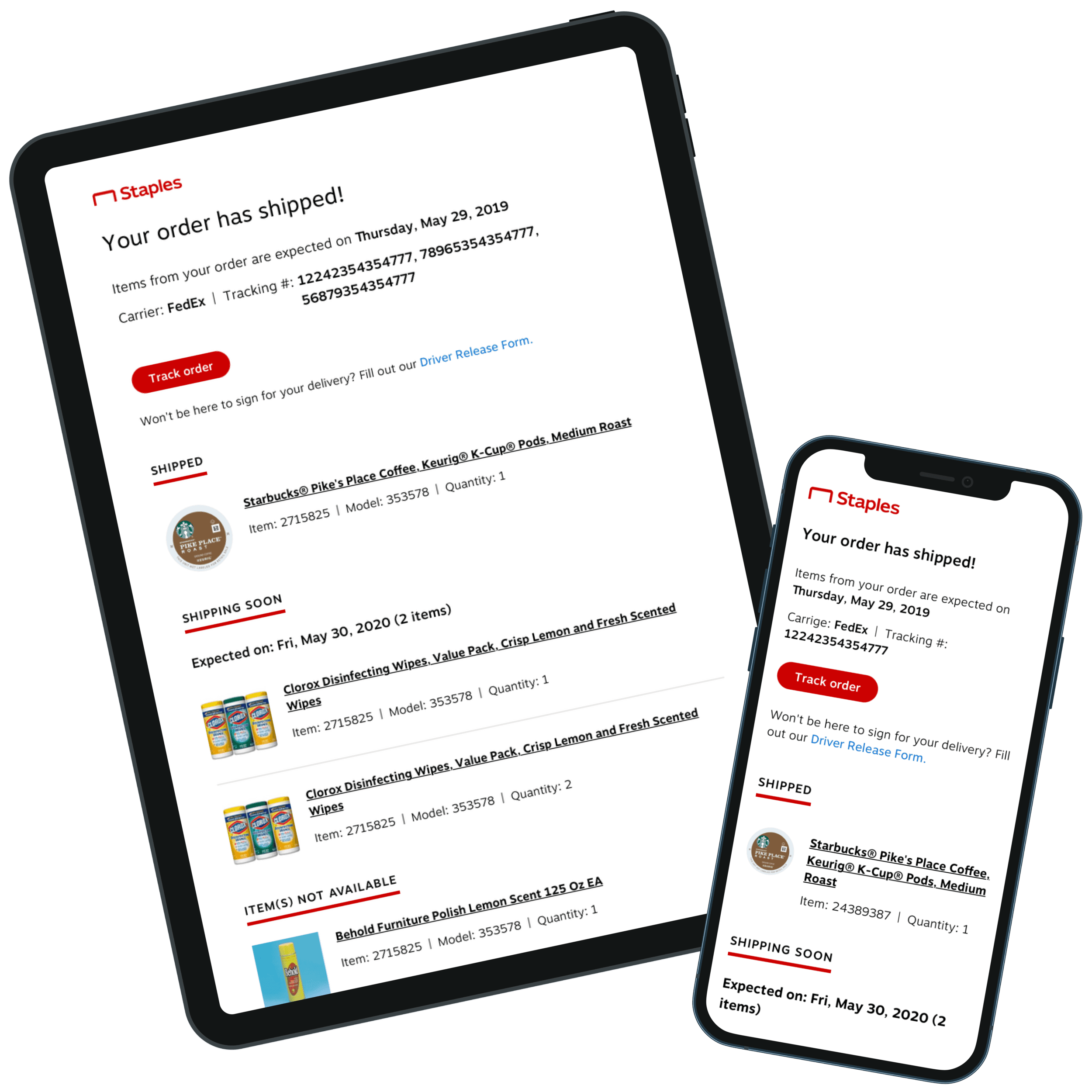
In addition to the websites, we also designed several email templates for Staples's regular and business customers. These templates are content-adaptive, ensuring compatibility across all device types.
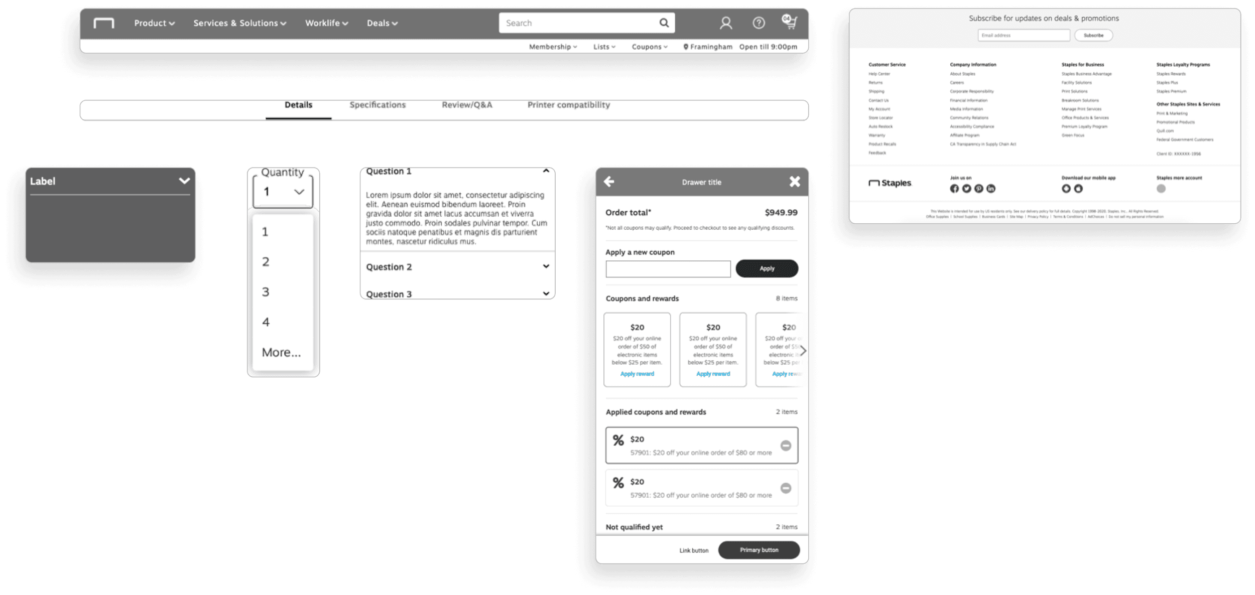
Axure Components
Finally, we utilized Axure to develop a separate component library for creating wireframes. This library, with its interactive components, facilitates quick and efficient usability testing of the wireframes with real users.
Featured Cases
Working With Constraints
Working under guidelines and principles has honed my ability to produce coherent designs across various projects. Direct interaction with clients has also refined my communication skills, allowing me to understand and meet their needs effectively.
Building Design Systems
Creating and managing a design system has ingrained in me the significance of consistency and efficiency. I learned that a well-structured system is the backbone of any scalable project, especially in the dynamic environment of an e-commerce platform, where user experience is paramount.
How Design Sprints Work
Learning how design sprints function has revealed the benefits of rapid prototyping and iterative feedback. This knowledge was crucial in handling large-scale projects, where strategic planning and resource management are key to success.
