Chariot
Fostering trust and accountability in charitable giving.

Project overview
Chariot is a crowdfunding platform that fosters trust in charitable giving, ensuring donors feel confident and connected to the impact of their contributions.
As the sole designer on the team, I collaborated with the founders and engineering team to conceptualize and build Chariot's iOS app.
Timeline
3 months (Oct-Dec 2021)
Role
Product Designer
Team
1 Product Designer
2 Co-Founders
1 Project Manager
5 Developers
Tools
Figma
Jira
Platform
iOS app
Status
Shipped
Problem context
The crowdfunding industry faced major trust issues and a significant disconnect between donors and campaign creators.
13%
Repeat donors
In 2021, major platforms saw only 13% of donors making repeat donations within six months.
~37%
Fraudulent campaigns
Many campaigns showed signs of potential fraud, primarily in medical and emergency relief.
28%
Goal achievement rate
This trust gap severely impacted first-time campaigns, with only a few reaching their goals.
Research insights
What led to these staggering numbers?
After reading articles, product reviews, and blogs online, and talking to two active donors and one campaign creator, I identified three main problem areas.
gpp_maybe
Inadequate verification
Minimal verification requirements allowed fraudulent campaigns to exploit emotional causes.
visibility_off
Opaque fund usage
Inadequate fund tracking and reporting made it hard for donors to view their money usage.
public_off
Impact disconnect
Crowdfunding platforms lacked effective tools to show the real-world impact of donations.
Core challenge
How might we design a crowdfunding platform that prioritizes legitimacy while keeping donors informed and connected to the impact of their contributions?
Solution highlights
Prioritizing legitimacy, transparency, and security to deliver a seamless and informative donation experience.
Timeline
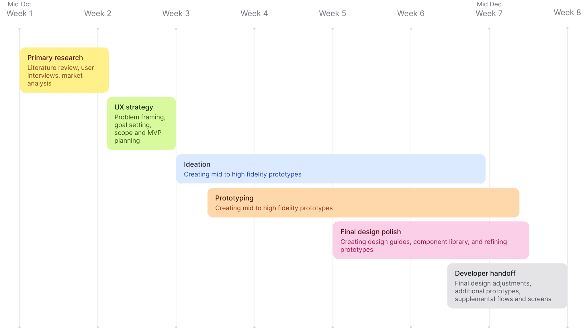
With the problem space relatively well defined, I prioritized ideation and prototyping to validate solutions and reserved time for documentation and developer collaboration in the final stages.
Opportunity mapping
I began by dissecting the core challenge and connecting it to the research insights.
For each of the three problems identified earlier, I mapped out a design opportunity that served as the baseline for the solutions.
gpp_maybe
Inadequate verification
Minimal verification requirements allowed fraudulent campaigns to exploit emotional causes.
visibility_off
Opaque fund usage
Inadequate fund tracking and reporting made it hard for donors to view their money usage.
public_off
Impact disconnect
Crowdfunding platforms lacked effective tools to show the real-world impact of donations.
How can we help donors instantly verify legitimate campaigns without multiple checks?
How can we make fund spending visible and trackable in real-time?
How can we connect donors directly to the impact of their contributions?
Competitor analysis
Next, I reviewed how industry leaders handled trust issues, if at all.
I analyzed GoFundMe, Kickstarter, and Givelify's apps, focusing on impact reporting, fund usage transparency, campaign legitimacy, and the donation process to find that none of them were taking any steps to tackle the trust gap.
Contact
Ideation process
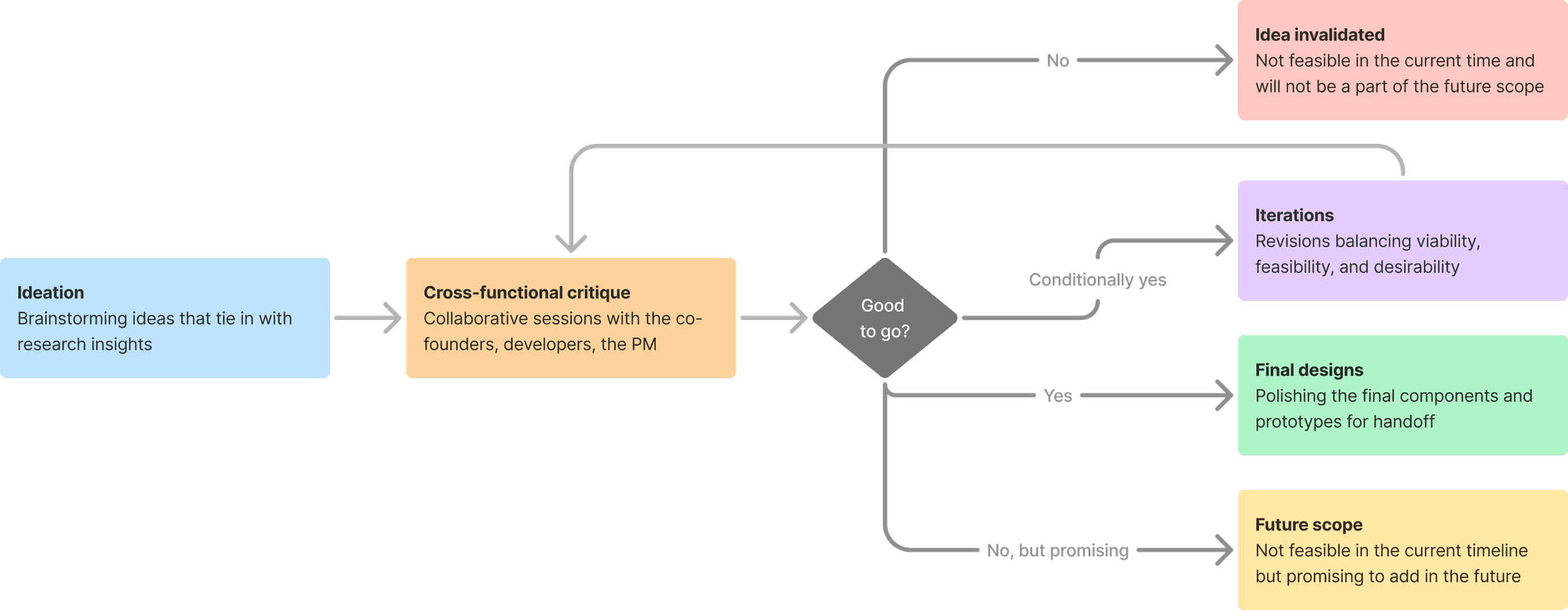
I used a lean process with brainstorming, team feedback sessions, and rapid iterations to create practical solutions that the development team could implement quickly.
Challenge 1
How can we help donors instantly verify legitimate campaigns without multiple checks?
Underlaying problem
A rise in fraudulent campaigns led majority of donors to spend 30+ minutes manually verifying campaigns across multiple platforms and sources.
Design approach
I explored solutions that would provide donors with an instant, high-level overview of a campaign's legitimacy while offering the option to delve deeper if desired.
Solution
Trust score system
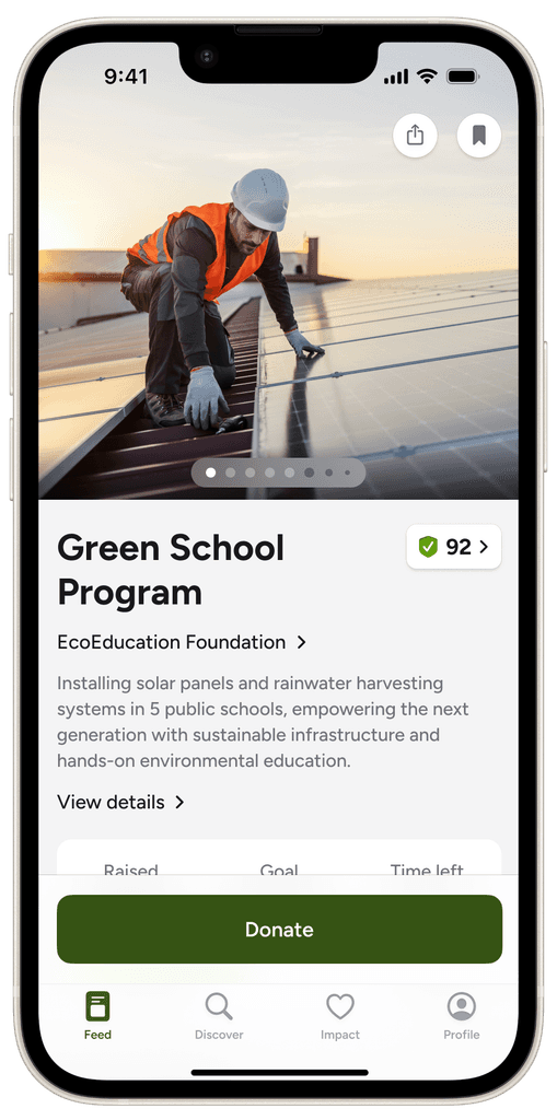
Similar to a credit score, a trust score offers a quick, high-level indication of a campaign's legitimacy, giving donors an instant signal before they choose to explore further.
I created a basic verification checklist using online data and refined it to meet stakeholder requirements. Each item in the checklist contributes a specific percentage to the overall score.
Trust score sheet
An interactive fund allocation donut on the campaign details screen displays a high-level breakdown of raised funds across different campaign goals.
design iterations
The trust score sheet was revised multiple times based on feedback from cross-functional critique sessions with the founders and developers.
Challenge 2
How can we ensure fund spending is transparent and trackable to reassure donors their money is being used appropriately?
Underlaying problem
Donors were concerned about the allocation and effectiveness of their contributions, especially with a ~37% increase in potential fraud, leaving them unclear about their donations' impact.
Design approach
Through my research, I found that donors wanted to know two things: how much of the raised money the campaign is utilizing and for what purposes, and how their individual contribution is being used.
Macro
General fund allocation
Knowing how much of the total funds raised is utilized and for what purposes.
Micro
Immediate fund allocation
Knowing how a donor's individual contribution would be used immediately.
General fund allocation solution
Fund allocation dashboard
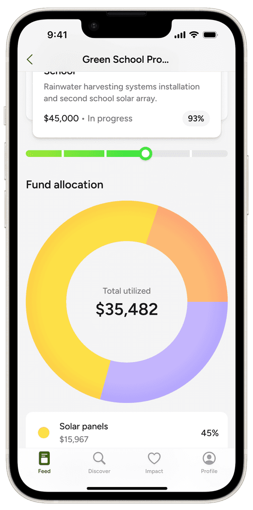
For general fund allocation, I designed a live dashboard on the campaign's detail page, offering a high-level view of fund allocation toward immediate and long-term goals with dynamic updates.
Interactive fund allocation donut
An interactive fund allocation donut on the campaign details screen displays a high-level breakdown of raised funds across different campaign goals.
Category drill down
A stacked modal showing a detailed spending summary in a particular category.
Actual vs estimated spending
Donors can check if the campaign is meeting, exceeding, or falling below the planned spending over a custom timeline.
Spending timeline
Donors can track how funds have been progressively allocated to a specific category over a custom timeline.
Immediate fund allocation: Solution 1
Milestone updates
For immediate fund allocation, I proposed a milestone-based approach with a structured progress view that breaks down fund utilization into clear, measurable phases. This helps donors understand how their contributions align with the campaign's broader roadmap while providing transparent checkpoints for fund releases.
milestone cards
Milestones are displayed as slider cards on the campaign details page, allowing users to view progress made and the campaign's future scope.
Milestone details
Tapping on a card opens a modal with details of the selected milestone.
Immediate fund allocation: Solution 2
Impact oriented donation flow
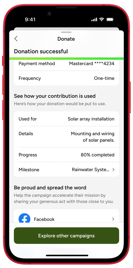
A donor's immediate fund allocation details must be displayed as part of the donation flow. If the allocation isn’t finalized at the time, they can still see the probable areas where their contribution might be used, based on current milestone needs.
donation flow
Added a section on the post-donation screen where donors can see how their funds might be utilized immediately.
imapact section breakdown
Section breakdown
The immediate thing the funds will be used for.
A brief description of how the funds will be utilized.
Overall progress of the associated milestone.
A link to view associated milestone details.
Challenge 3
How can we connect donors directly to the impact of their contributions?
Underlaying problem
Crowdfunding platforms lacked effective tools to showcase the real-world impact of donations. This gap makes it difficult for donors to see the results of their contributions, leading to emotional detachment from causes and reduced long-term engagement with the platform.
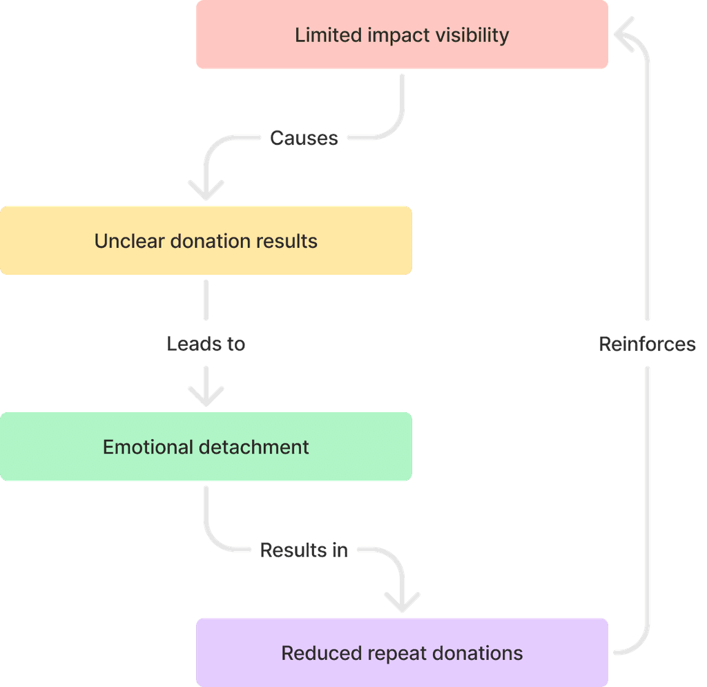
Above: A diagram illustrating low impact visibility impacts repeat donations.
Design approach & ideation
I used a "top-down design approach", starting with a broad overview of our goals and gradually refining the elements. This ensured a solid foundational structure before focusing on finer details. I began by identifying high-level elements to display on the page and then progressively refined each one.
Solution
Impact dashboard
The final impact page designs effectively tackle the problem of impact visibility with several key features. Together, these elements convert abstract donations into tangible, meaningful impacts that donors can monitor and connect with.
Handoff
This project was assigned to me while I was working at Galaxy Weblinks, a design agency. The scope of the project was limited to delivering design assets, as the client had their own development team. My role concluded with handing off the final design assets to the developers, and I was not informed about the subsequent steps taken by the client.
Reflection
Key learnings
partner_exchange
The value of emotional connect
I realized that pure data visualization alone isn’t enough to create meaningful impact. My initial designs focused too much on numbers, but integrating metrics with human stories fostered a much stronger emotional connection.
smartphone
iOS app design patterns
I reviewed various official and unofficial resources to familiarize myself with different styles, best practices, and design patterns in iOS.
groups_3
Early and frequent cross-collaboration
By conducting focused brainstorming sessions and seeking immediate cross-functional feedback, I avoided prolonged design cycles and delivered within the timeline.
restart_alt
Lean UX design
The build-measure-learn cycle helped me validate assumptions early, pivot when needed, and deliver a solution that aligned perfectly with the initial problems.
Other cases
Back to top
arrow_upward


