South East
National Bank
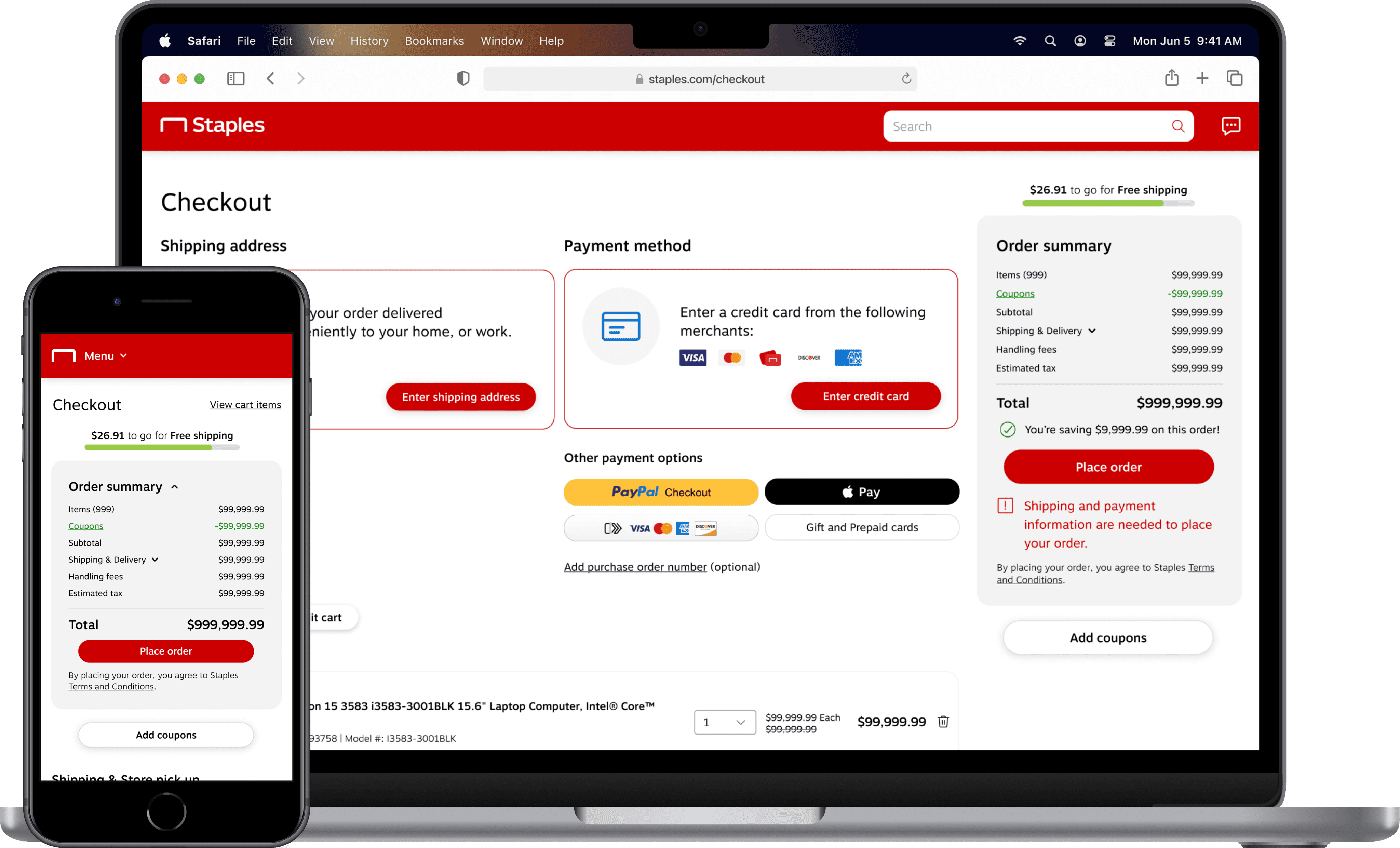
Enhanced the discoverability and usability of banking workflows to increase user engagement.
Project overview
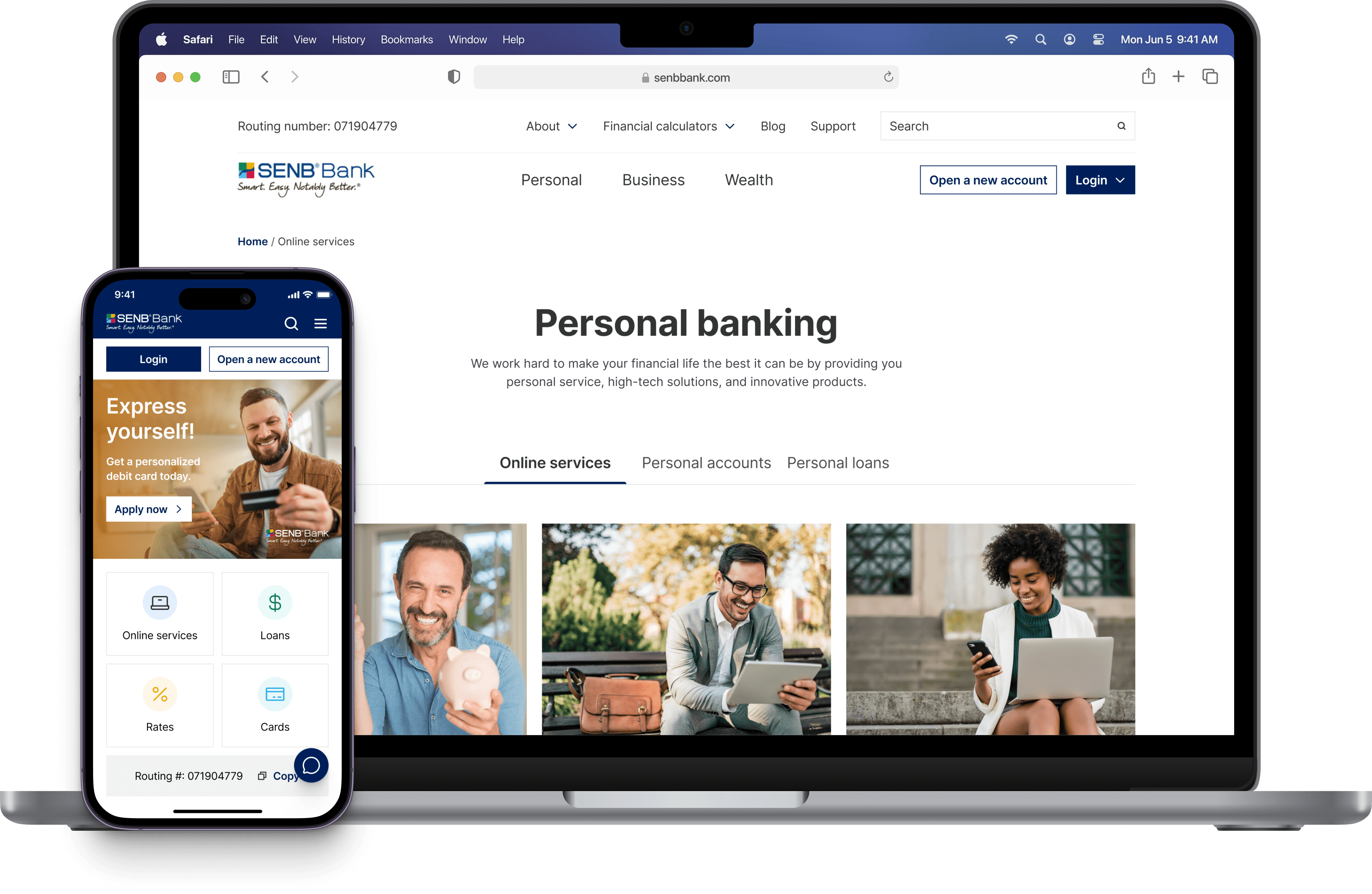
SENB bank faced challenges with its online presence despite its strong local service. I redesigned their website to improve accessibility and simplify processes, boosting new account openings, engagement, and reducing support requests.
Timeline
1 month (May 2020)
Team
1 Product Designer
2 Client stakeholders
1 Project Manager
3 Developers
Role
Product Designer
Tools
Figma
Loop11
Platform
Website
Status
Shipped
Problem context
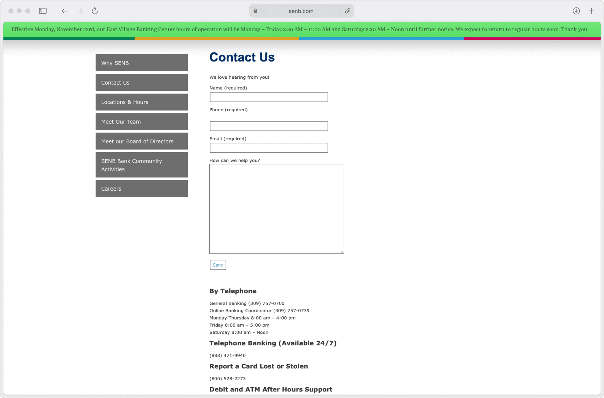
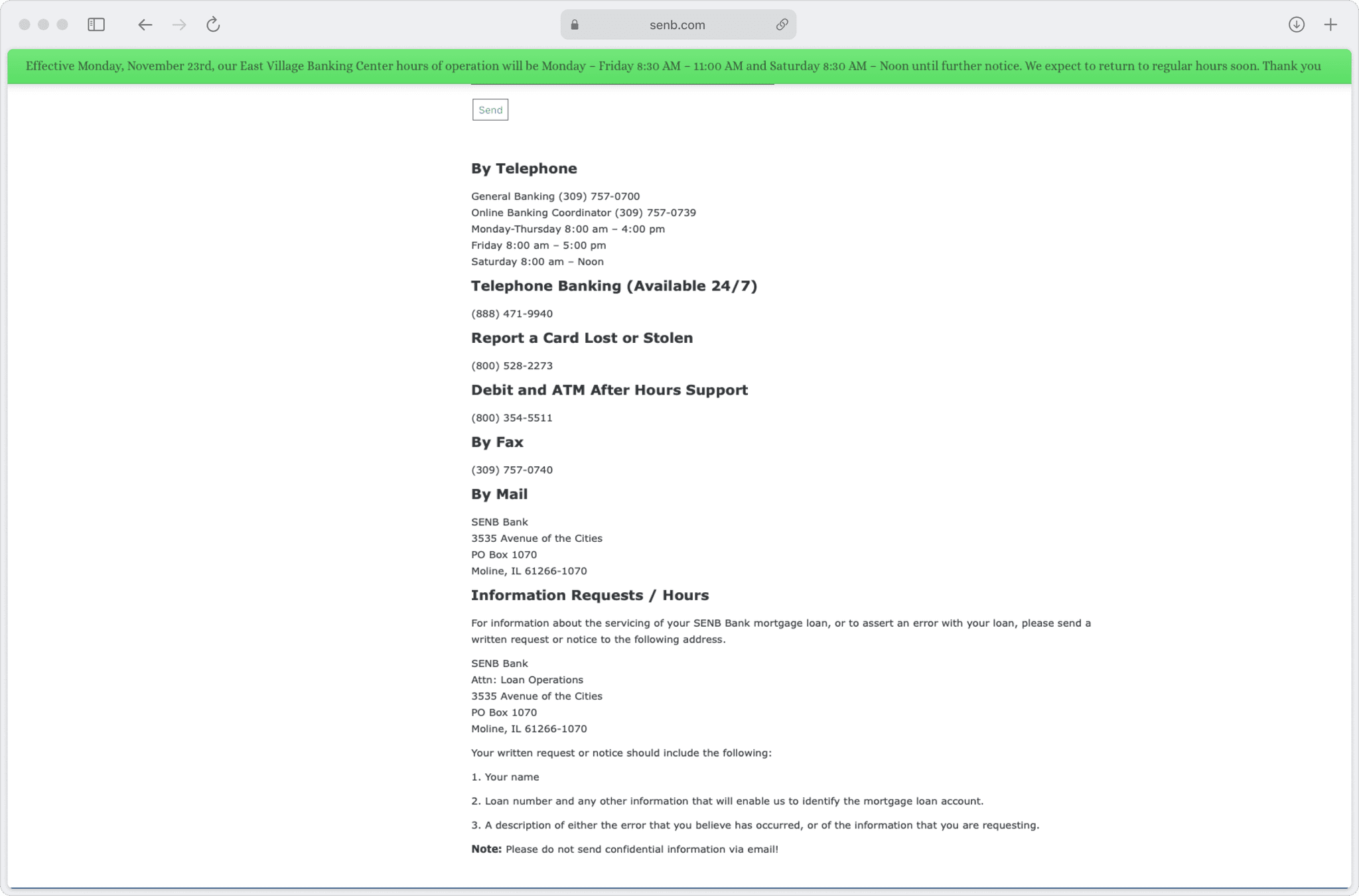
Users faced difficulties finding information and completing tasks on the bank's website, resulting in low engagement and poor reviews.
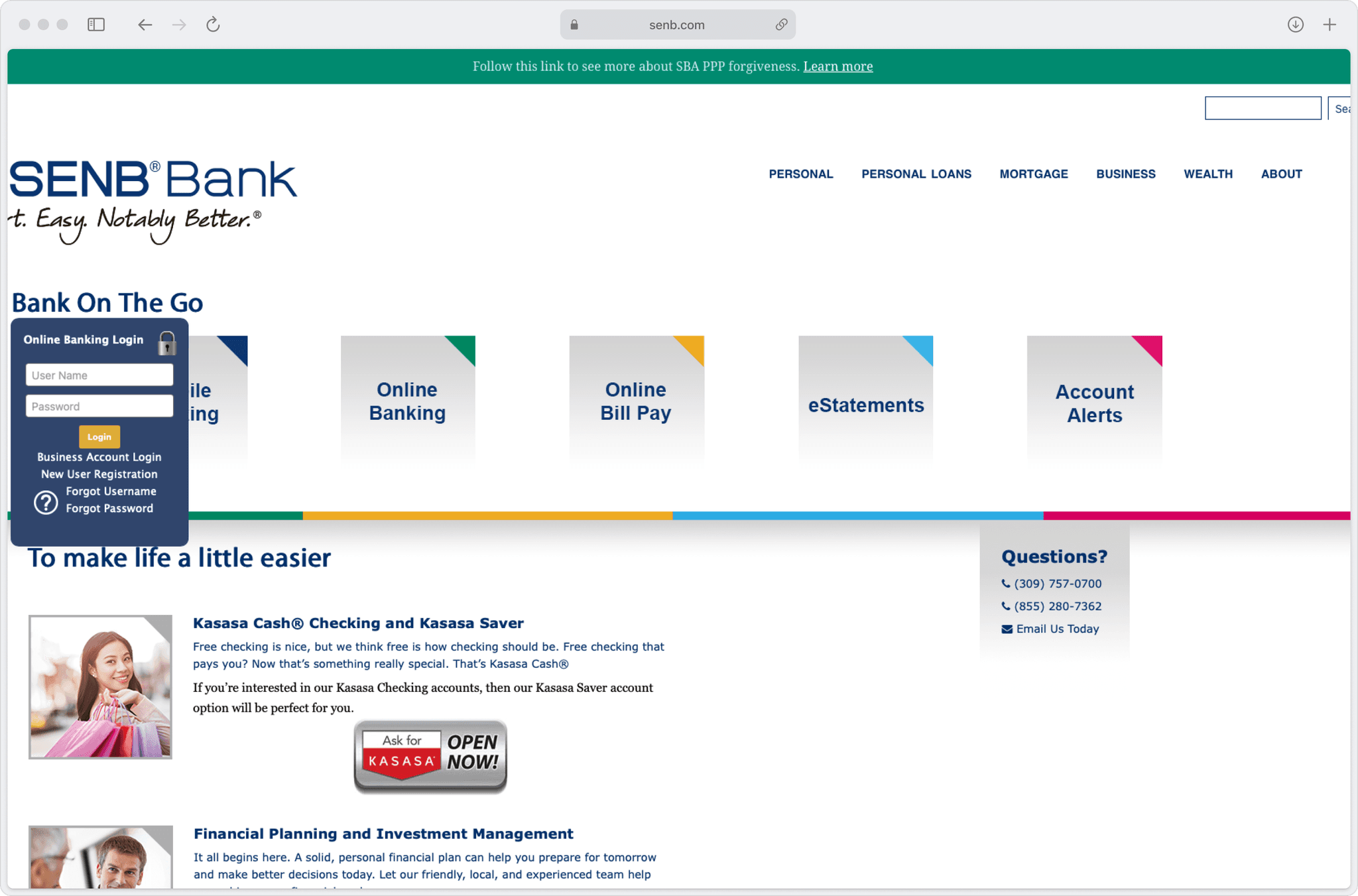
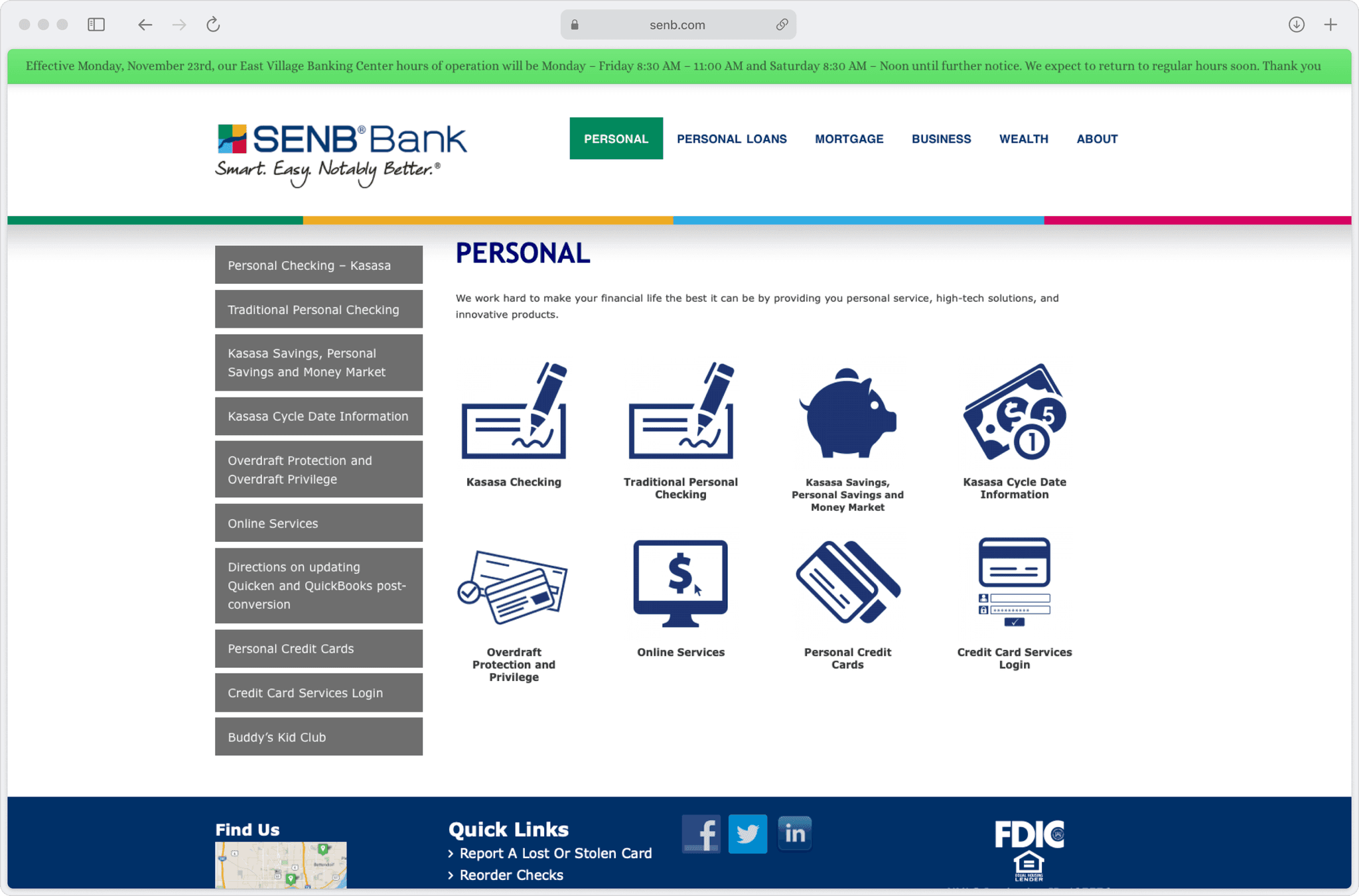
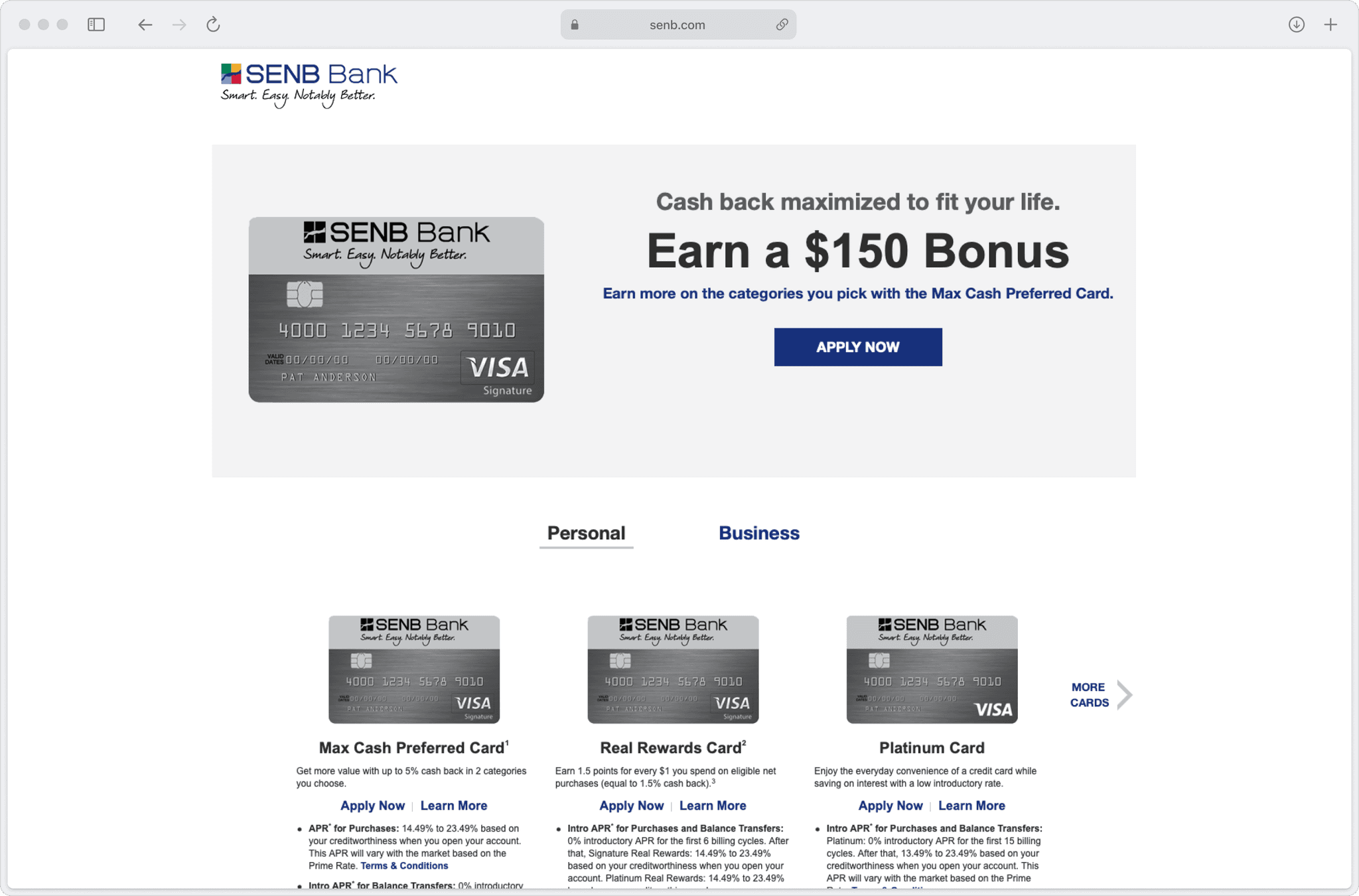
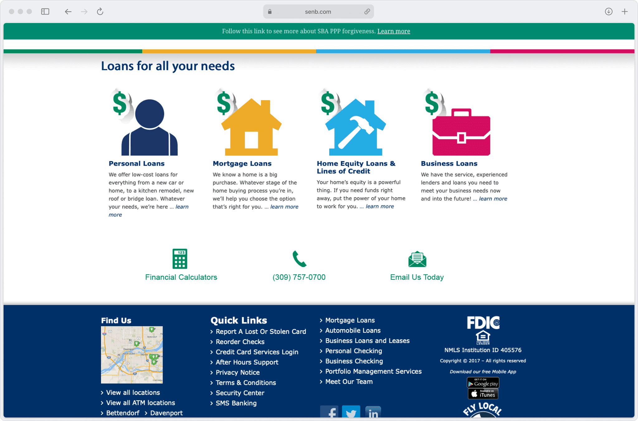
Legacy UI patterns, inconsistent navigation, complex copywriting, and high cognitive load per screen were the major reasons the website wasn't efficient or appealing.
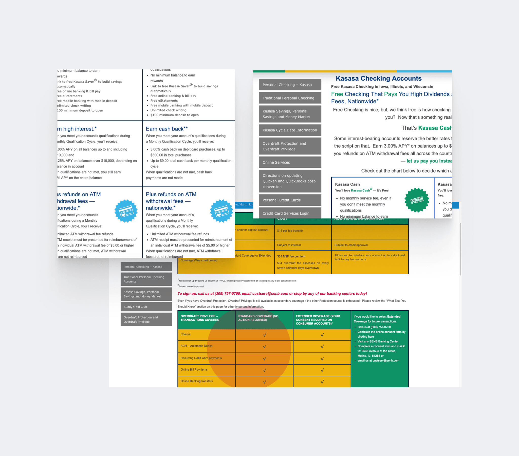
Above: Key pages of the website prior to the redesign.
This disconnect between the bank's physical and digital presence was hindering its business growth, as reflected below in the staggering numbers shared by the bank.
67%
Bounce rate
Unable to find what they’re looking for, users often chose to abandon the site.
1m 45s
Average session duration
Users weren't engaging deeply with the site's content.
32%
Task completion rate
Even after finding the right information, users were't usually able to finish their tasks.
~3%
New account openings
Poor reviews steered potential customers away from the bank.
"It's like the website is stuck in the past, cluttered and confusing. I often end up giving up because I can't find what I need quickly. It shouldn't be this hard."
— Anonymous customer review
Core challenge
How might we simplify SENB Bank's website to help users easily find information, complete tasks, and stay engaged?
Contact
Solution
A design overhaul to enhance the discoverability and usability of banking workflows to boost user engagement and appeal.
Improved navigation structure and hierarchy
In the refresh, I restructured the navigation to make it shallower (up to 2 levels max) and kept the sought-after services and flows at the surface for easy access.
I implemented a hamburger menu inspired by Chase's design, making it easy to access and providing quick links to essential information like the routing number.
User control & freedom
I added clear signs and controls so users always know where they are and what's happening, and can go back if they need to. Also reorganized information-dense pages to bring hierarchy and clarity.
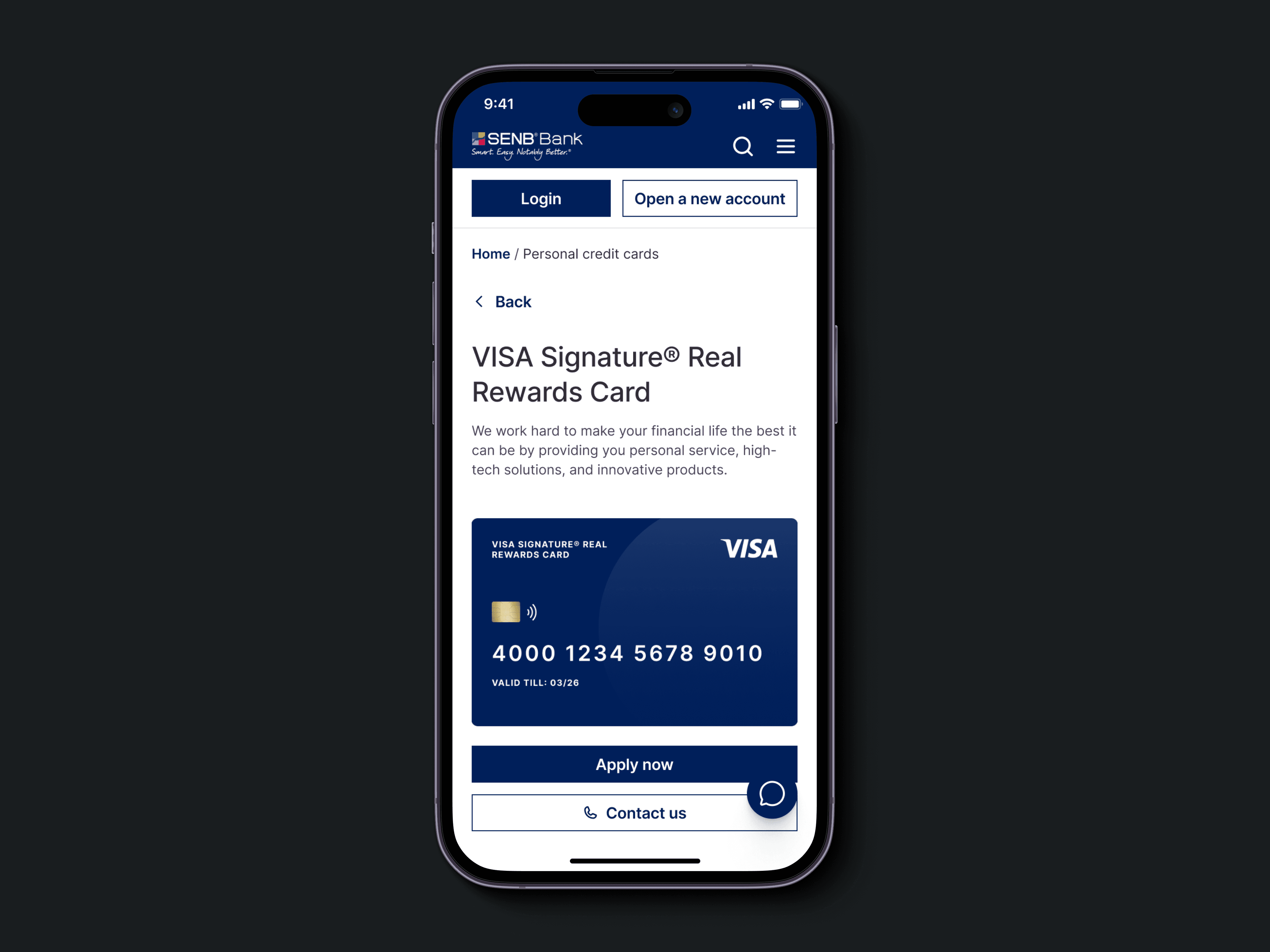
Supplemental information
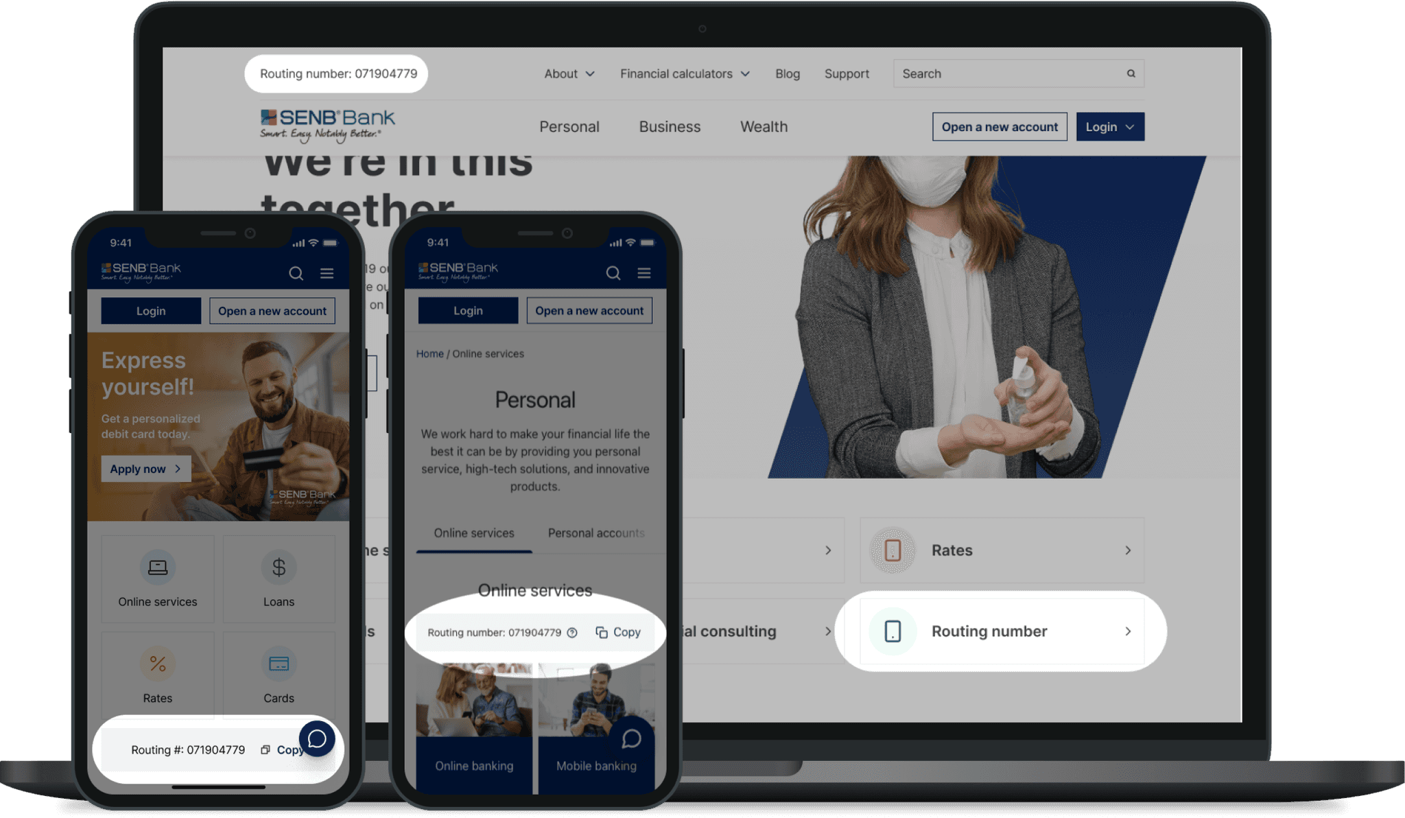
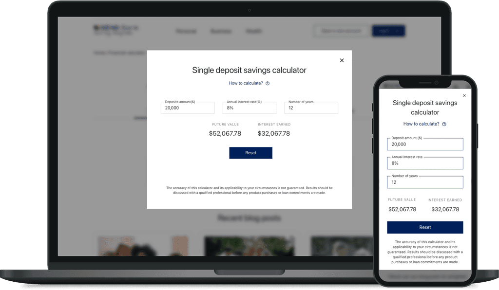
Brought supportive information and services to the forefront, complementing parent flows. For example, the bank's routing number and financial calculators were previously buried under several links, forcing users to break their task flow to find them when needed.
Instant help & support
Users had to fill in request forms for the smallest things, and the telephonic service always had long waiting lines. Quick assistance was unavailable. I introduced a chatbot that sticks to the bottom right of the page, always within reach—especially on a handheld device. It contains FAQs, live chat support, and options for further assistance.
Ubiquitous Login & account access
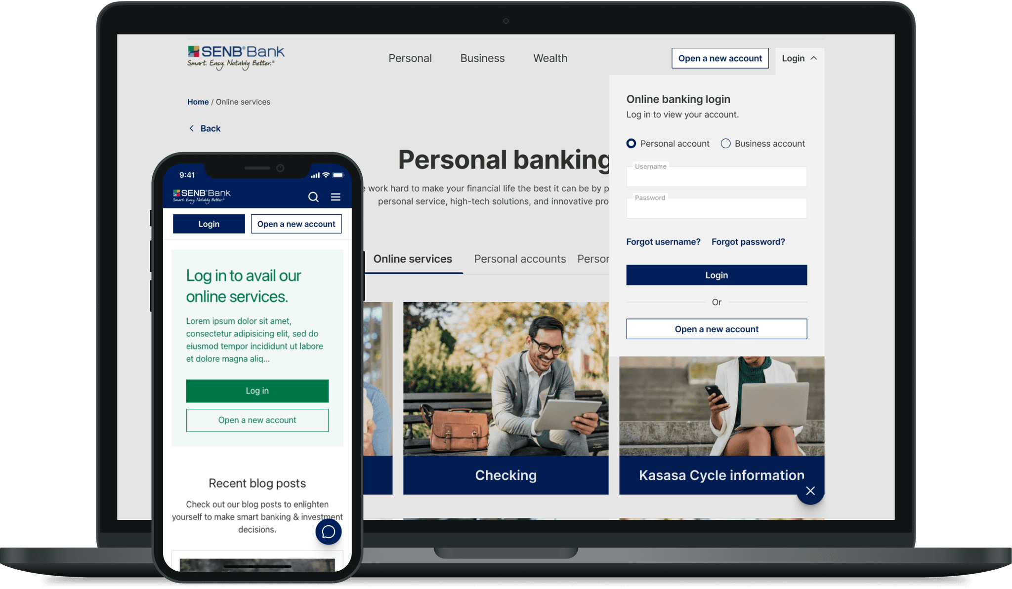
Combined different login types into a single fly-out menu and made it a part of the main navigation for easy access. Also added supplementary login banners across inner pages where it's required for users to log in.
Impact
It wasn't long until we saw the metrics change for the better.
24%
Bounce rate
Improved usability and discoverability reduced task abandonment.
48%
Average session duration
Ease of navigation made it easier to access information on the site.
27%
Task completion rate
Users were able to complete tasks online that they previously visited a branch for.
57%
New account openings
Noticeable increase in new account openings and loan applications.
"I haven't called customer service for help at all. Everything I need is easy to find, especially my routing number for setting up direct deposits."
— Anonymous customer review
Note: The impact metrics were observed over approximately 12 months after development to determine the effectiveness of the changes on user behavior and engagement.
Approach
I began by creating an overarching user story for the problem, which helped me organize my efforts clearly — “As a user, I want to quickly and easily engage with the information I seek.”
This led to two key questions:
breaking_news_alt_1
What factors make it difficult to find information on the site?
Answering this would help improve the site's wayfinding, scanability, and overall clarity of information.
search
What kind of information do users typically look for?
Understanding this would help me refine the information hierarchy by prioritizing what matters most and de-emphasizing the rest.
Key question 1
What factors make it difficult to find information on the site?
Heuristic evaluation
To find out, I conducted a thorough heuristic evaluation of the existing site using NN Group's 10 Usability Heuristics.
Inefficient navigation
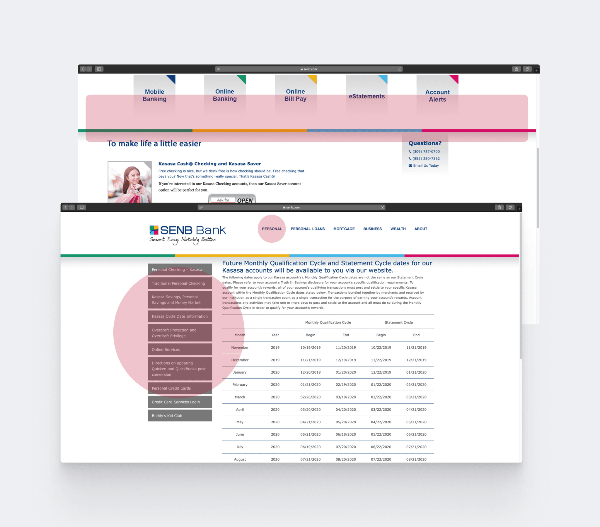
The main navigation didn't stay affixed at the top and had a deep structure which made it harder for users to find information quickly, increasing frustration and abandonment rates. A lack of indicators added to the confusion, leaving users unsure of which page they were on.
Complex copywriting
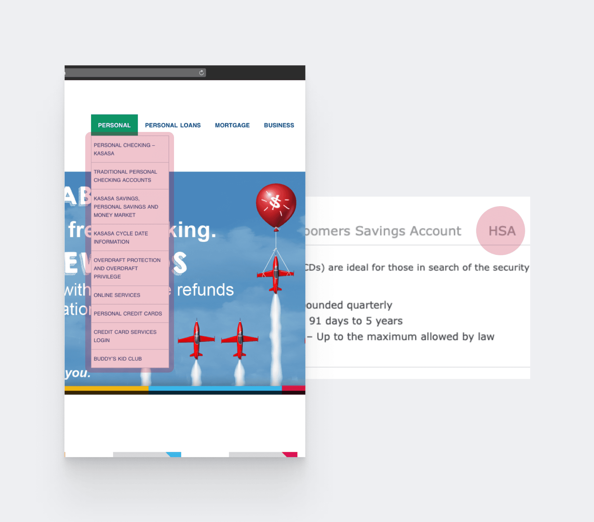
I also noticed numerous financial jargon and abbreviations that could confuse a layman, making the information harder to understand and less accessible.
High cognitive load
Another major issue with some information-dense pages was the excessive, disorganized content crammed onto a single page, making it difficult for users to scan and find information easily. The striking color combinations further added to the visual clutter.
Key question 2
What kind of information do users typically look for?
Primary research
To uncover this, I started by understanding users' general behavior and experiences with online banking.
I sent an online survey to 40 people in the Quad Cities area, where the bank is located, to gather a more focused and relevant set responses.
32 people responded, revealing two key insights:
smartphone
Most users preferred accessing their bank's website on their phone.
assignment
Users were unhappy about filling out requests forms for online banking problems.
Behavior analysis
At the same time, I wanted to understand how users typically behaved on SENB Bank's website—how they navigated it and what they searched for.
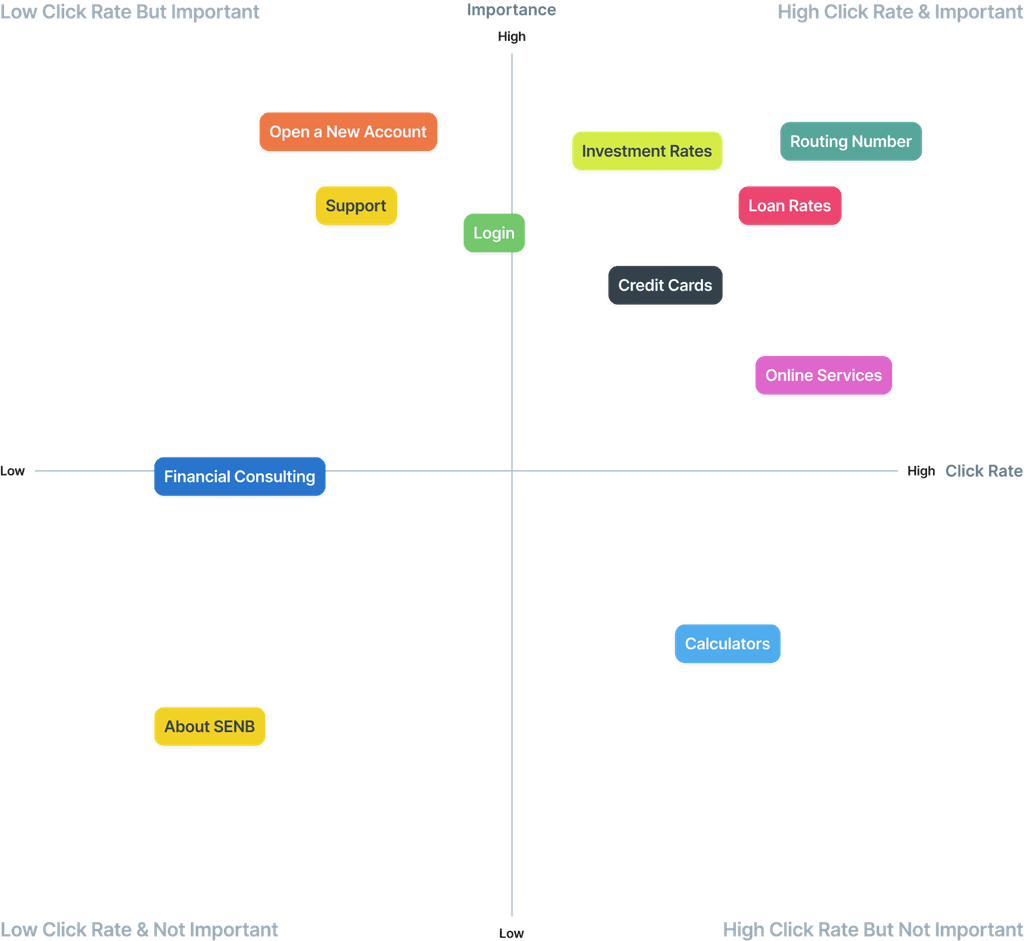
I analyzed multiple Google Analytics reports to better understand the users’ existing interactive experience with the site.

I mapped the findings on a quadrant to identify items with high click rates and importance, helping to improve the site structure.
Routing numbers, investment rates, and the option to open a new account were the top three things users searched for. This was surprising, as these are basic features that should be easily accessible on a banking website.
Open card sorting
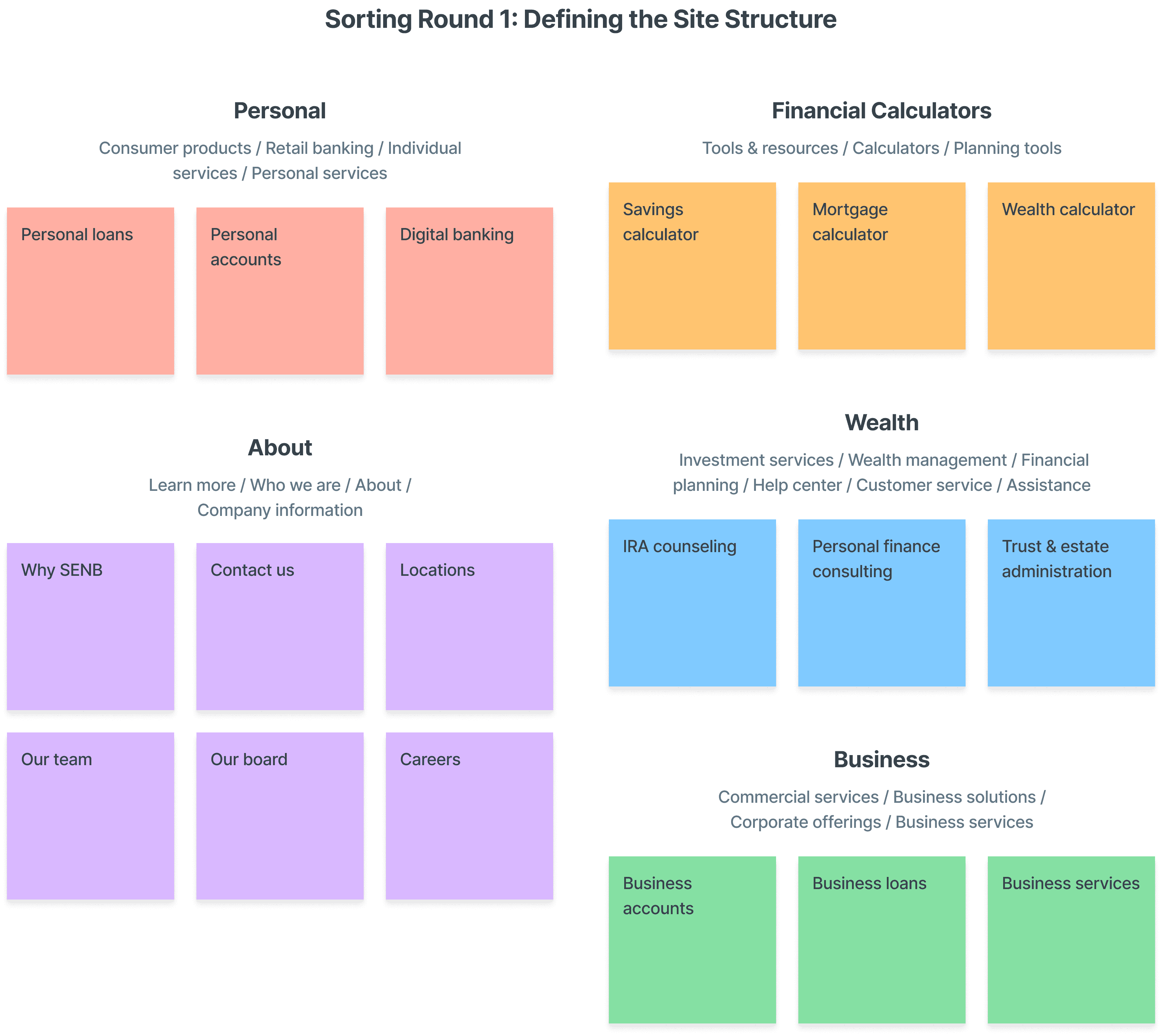
I didn’t want to base the new site structure solely on factual data; I also wanted it to feel natural and intuitive.
I conducted two open card sorting exercises with 4 participants and used the insights to build a new information architecture.
The first round focused on rebuilding the site structure. I asked the participants to categorize cards into into different groups and name them based on their understanding.
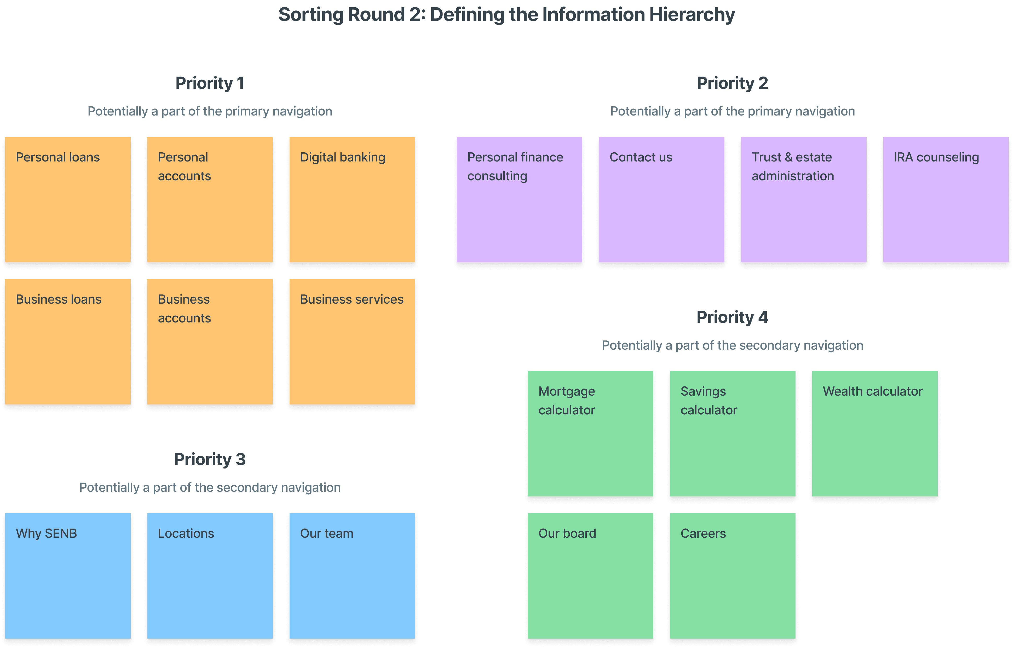
The second round was more about defining the site structure. I now asked the participants to place the same set of cards based in different groups based on their importance.
Information architecture
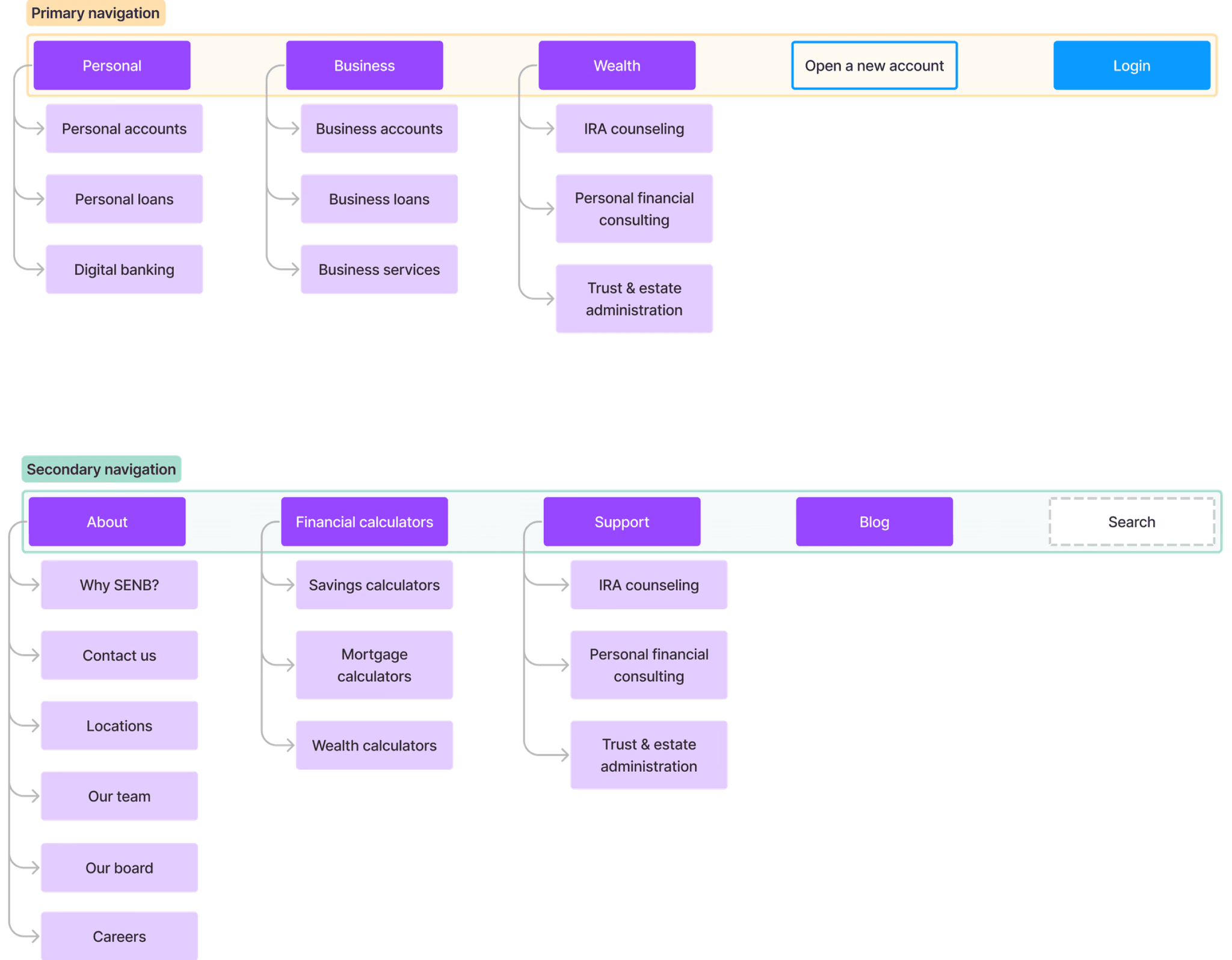
Based on these insights, I designed a new site information architecture that balanced user intuitiveness with business needs.
The primary navigation included the priority 1 & 2 items, while the priority 3 & 4 items formed the secondary navigation.
Competitive analysis
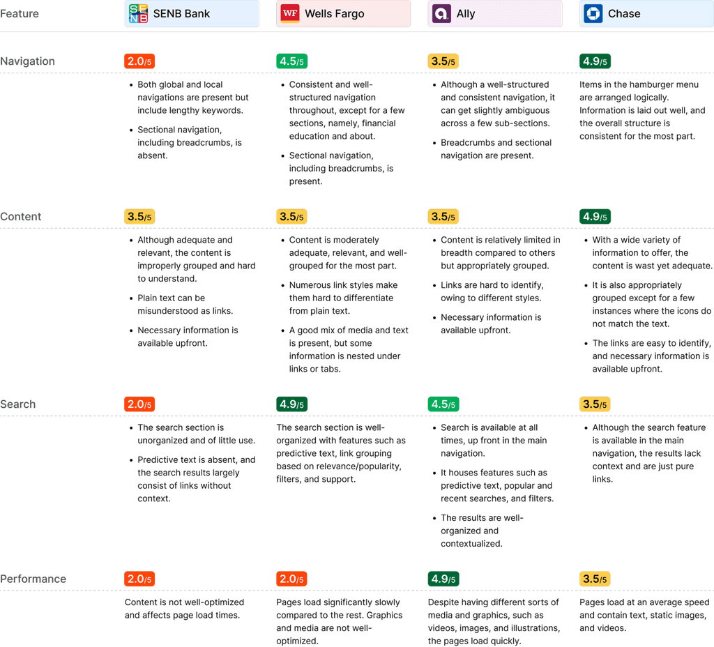
Before starting ideation, I assessed major banking websites to understand industry best practices I could apply in my solution.
Some findings were directly related to design, while others focused on improving backend performance.
Low-fidelity prototypes
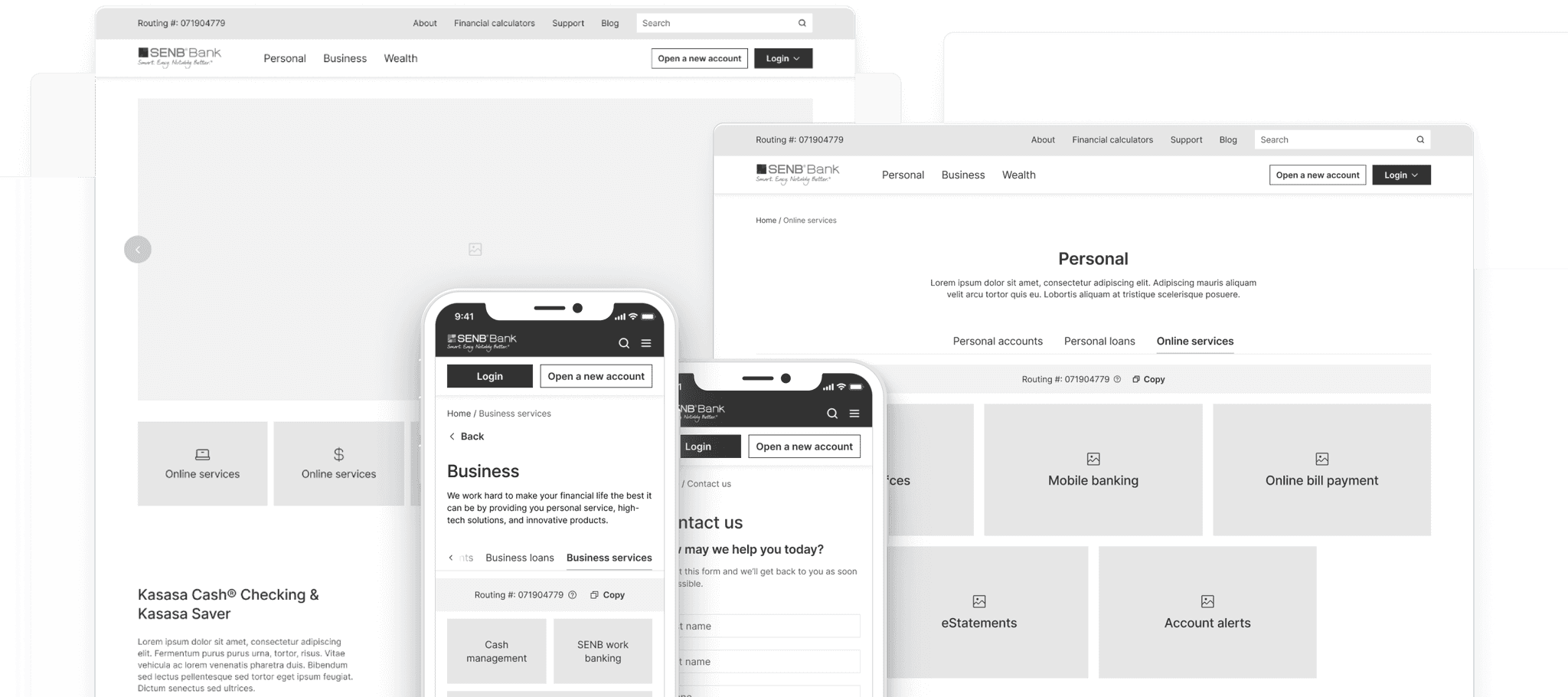
With the foundation in place, I created mid-fidelity wireframes to validate my ideas with the team and real users.
User testing
I conducted a virtual, unmoderated task-based testing session with participants from the Quad Cities area in the US.
I gathered 4 participants and assigned them 9 tasks each to complete, encouraging them to think aloud to understand their thought process better. We used Loop11 for these sessions.
Key feedback
visibility_off
Routing number felt obscure.
open_in_new
Opening calculators in a new page was unintuitive.
indeterminate_question_box
Consulting an expert was misunderstood as seeking support.
Revisit final solution
arrow_upward
Other cases
Back to top
arrow_upward
